ContentStudio API plan is now available. Create automations using Claude, Zapier, n8n, make, etc. Explore plan!
Facebook cover photo size: The complete 2025 guide
Getting your Facebook cover photo size right is as important as your storefront’s window display. Get the size wrong, and it will look like rundown, crooked signage that screams, “We don’t have our act together.”
The Facebook cover photo size might seem straightforward, but there’s more to it than slapping any random image up there and calling it a day. Between desktop and mobile displays, different page types, and Facebook‘s ever-evolving specs, getting your Facebook banner right requires knowing the exact dimensions and optimization tricks.
This guide cuts through the confusion with all the current sizing requirements, optimization strategies, and common mistakes that make your cover photo look like it was designed in 2012, all addressed in one place.
Dimensions of Facebook Cover photo size
On a desktop, the Facebook cover photo measures 851 pixels wide by 315 pixels high. Meanwhile, users on mobile devices will see 640 by 360 pixels.
What is the current Facebook cover photo size?
Your page’s cover photo specifications are non-negotiable if you want professional results. Here’s the official rundown:
Facebook cover photo dimensions
The current Facebook cover photo dimensions are 851 x 315 pixels while also being left-aligned with a full bleed. Only an image of this size ensures your image displays correctly without awkward cropping or stretching that makes your brand look amateur.
Going smaller than the minimum 400 x 150 pixels will result in a pixelated mess that belongs back in 1978. Going too large creates unnecessarily slow load times that’ll frustrate users before they even see your content.
Facebook cover photo size ratio
The 16:9 aspect ratio is your North Star here. This ratio ensures your Facebook banner maintains its proportions whether someone’s viewing on desktop, tablet, or mobile. Stray from this ratio, and Facebook’s algorithm will crop your image in ways you probably won’t like.
Remember its importance this way, the 16:9 ratio is the same as most TV screens and YouTube videos. It’s designed for modern viewing habits.
Facebook cover photo file format and size
Facebook prefers sRGB JPG files under 100 kilobytes. This is the format that loads fastest and displays most consistently across devices.
PNG files work too, but they’re typically larger and slower to load. In the attention economy, every second counts, and a slow-loading Facebook cover happens to be a conversion killer.
These specs aren’t suggestions but Facebook’s official requirements for optimal results. Ignore them at your own risk.
Facebook page cover photo size on desktop vs mobile
Your Facebook cover size displays differently depending on the device you’re running Facebook on.
Desktop: Shows the full 851 x 315 pixel dimensions
Mobile: Crops to 640 x 360 pixels, showing mainly the center portion.
This means critical elements (like text or logos) need to be positioned in the center-safe zone, not spread across the entire width.
Also Read: How to Fix Facebook display problems?
Facebook cover photo safe zone
The safe zone is approximately 640 x 315 pixels centered within your 851 x 315 canvas. Anything outside this zone might get cropped on either mobile or desktop devices.
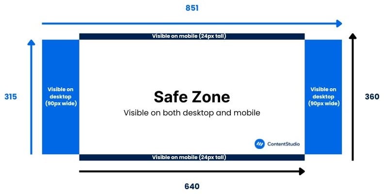
Place your most important visual elements, such as logos, key messaging, and faces, within this safe zone. Think of the outer edges as bonus real estate that enhances the desktop or mobile experience but isn’t essential for your message.
Facebook cover photo sizes by page type
Not all Facebook covers are created equal. Different page types have completely different purposes as well as sizing requirements:
Facebook profile cover photo size
Personal profiles use the standard 851 x 315 pixel dimensions. This applies whether you’re building a personal brand or just want your profile to look polished.

Facebook business page cover photo size
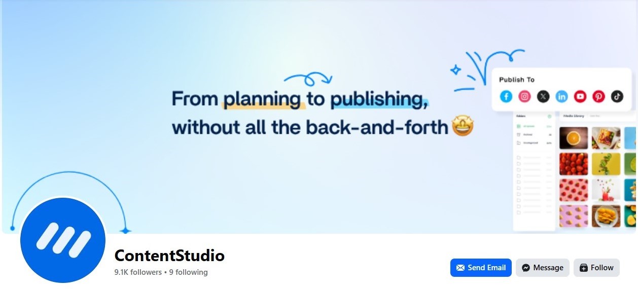
Business pages also use 851 x 315 pixels, but the stakes are higher. This is likely the first thing people see when they land on your page. Make it count with professional social media graphics that align with your online branding and overall marketing strategy.
Also Read: How to create a Facebook business page?
Facebook group cover photo size
Groups require larger dimensions: 1640 x 856 pixels. This bigger canvas gives you more room to showcase community guidelines, upcoming events, or group personality. The larger format works well for detailed graphics that need to communicate more information.

Facebook event cover photo size
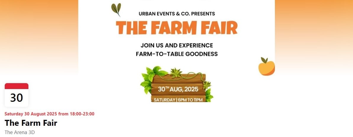
Event covers are the largest at 1920 x 1005 pixels. This size makes sense since events need to grab attention and communicate key details quickly. The larger format allows for more detailed information like dates, times, and venue details.
How to optimize your Facebook cover photo size
Getting the dimensions right is just the starting point. Optimization is where good covers become great ones.
Resizing guide
Start with the largest version you might need (1920 x 1005 for events) and work down. This prevents quality loss from upscaling. Use tools like Photoshop or Canva to resize properly.
Always check how your image looks at different sizes before committing. What looks great at full size might be illegible when scaled down for mobile.
Design tips for creating the perfect cover photo
A good rule of thumb for a great cover photo is to remember to prioritize visibility and information value. It shouldn’t be just a photo for the sake of a cover image; rather, it should have all 820×315 pixels of space it occupies serving a specific purpose, i.e., to add value to the page visually. With that in mind:
- Keep text large and readable: If someone can’t read your message on a smartphone, it’s useless.
- Use high contrast: Light text on dark backgrounds or vice versa. Avoid low-contrast combinations that disappear on certain devices.
- Embrace negative space: Don’t cram everything into every pixel. Give your design room to breathe.
- Consider your profile picture placement: On some devices, your profile pic might overlap with your cover photo. Design around this overlap, not against it.
Testing your cover photo across devices
Since cover photos are not one-size-fits-all, before going live, check your Facebook header on:
- Desktop computer
- Tablet (both orientations)
- Smartphone
- Different browsers
Each platform can render images slightly differently. What looks perfect in Chrome might look off in Safari or mobile apps.
Facebook Marketing
Manage and grow your brand on Facebook. Create, schedule, and publish posts, videos, and Reels to Facebook pages and groups.
Get Started for FREE
Common Facebook cover photo mistakes to avoid
1. Using the same cover photo
Brand consistency is important, but using identical covers across all social platforms shows lazy social media management. Each platform has different dimensions and user behaviors. Optimize accordingly.
2. Ignoring current sizing guidelines
Facebook updates their specifications regularly. Using outdated dimensions from three years ago will make your page look dated and unprofessional. Stay current with platform requirements.
3. Ignoring mobile optimization
Over 98% of Facebook users access the platform via mobile devices. Designing only for desktop is like building a website that only works on Internet Explorer; it is technically possible but practically useless.
4. Too much clutter
Your Facebook banner isn’t a billboard on I-95. You have seconds to communicate your message. Keep it simple, focused, and impactful. This applies to both the visual elements and text on the cover image.
5. Poor text and element positioning
Text too close to edges gets cropped, and important elements in corners disappear between desktop and mobile display dimension variations. Use the safe zone guidelines to position elements accordingly and test before going live.
6. Using blurry or pixelated images
Low-resolution images look bad; there’s just no other way to put it. Always use high-quality images and export at the correct dimensions. Blurry covers make people question your attention to detail in everything else.
Conclusion
Your Facebook cover is often the first impression people get of your brand. Make it count by following current size guidelines (851 x 315), optimizing for mobile, and avoiding the common mistakes that make covers look unprofessional.
The investment in getting these details right pays dividends in credibility, engagement, and professional appearance. In a world where everyone’s a critic and first impressions happen in milliseconds, your Facebook header better be pixel-perfect.
FAQs
What is the Facebook cover photo size?
The standard Facebook cover photo size is 851 x 315 pixels for both personal profiles and business pages. This translates to a 16:9 aspect ratio and should be saved as an sRGB JPG file under 100 kilobytes for optimal performance.
What is the best size for a Facebook cover photo?
The best Facebook cover size is 851 x 315 pixels for profiles and pages, 1640 x 856 pixels for groups, and 1920 x 1005 pixels for events. Always design with the mobile safe zone in mind and keep important elements within the center 640 x 315 pixel area to ensure they’re visible across all devices.
How do I get my cover photo to fit on Facebook?
If your cover photo doesn’t fit the dimension requirements, you can go to Add Cover Photo > Upload Photo and then drag it to best fit the display size so that any important information is visible. If that doesn’t work, try image resizing tools to make it the right size.
Recommended for you
