How to promote affiliate links on social media in 2026
Oct 2, 202616 minutes

Written by
Saif AliUpdated
Most people decide whether to stop scrolling in well under a second. In that moment, they are not reading your caption or weighing your offer. They are reacting to what they see: the color, the composition, the clarity of the message, and whether the post looks like it belongs to a brand they can trust.
That single reaction is what social media design is built to win. Social media design sits at the intersection of marketing, branding, and visual communication. It covers everything from the colors and fonts you use, to the way you size an image for each platform, to how you turn a plain video clip into a captioned, on-brand piece that keeps people watching.
Done well, it makes your content instantly recognizable and easy to understand. Done poorly, it blends into the feed and gets ignored, no matter how good the underlying idea was.
Social media design is the deliberate craft of planning, creating, and refining the visual elements that represent your brand across social platforms. It covers static images, infographics, carousels, short and long video, GIFs, and even how text and emojis read inside a caption.
The point is to communicate one message clearly while staying consistent with your brand, so every post looks like it came from the same place.
The purpose is to communicate a message clearly while staying consistent with your brand identity, so that every post feels like it came from the same place. It helps to separate two ideas that often get blurred together. Visual content is any image or video you publish.
Social media design is the deliberate, brand-aware craft of shaping that content so it works on a specific platform, for a specific audience, with a specific goal. A photo posted without thought is visual content.
Social media design is broader than static graphics. The main formats you will work with include the following:
Social media design matters because on most platforms it is the first thing a person experiences, and often the only thing, before deciding whether to engage.
It builds credibility, strengthens recognition, helps you stand apart in a crowded feed, and drives the early engagement that platforms reward with more reach. Design is not decoration. It is the deciding factor.
Design builds credibility because your profile is often the first place someone meets your brand, before any review, website visit, or conversation.
A clean, consistent visual presence signals that you are established and dependable, while a messy one raises doubt, even subconsciously. Trust is cumulative: the same fonts and colours across dozens of posts read as reliable.
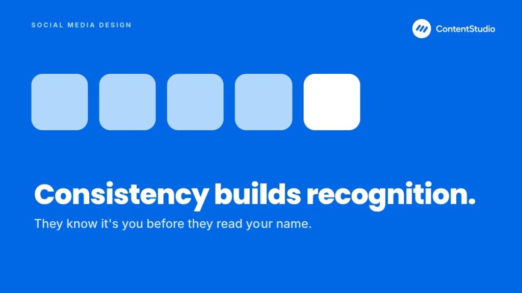
Recognition is what happens when someone sees your content and knows it is yours before they see your name. It is built through repetition of a deliberate visual system: a consistent color palette, a recognizable type style, a repeatable layout, and a distinct tone.
Over time, those repeated cues train your audience to associate certain visuals with your brand.
The strongest brands in the world lean on this heavily. A specific shade of red, a particular kind of minimalism, a signature layout- all of these become shorthand for the brand itself.
Feeds are saturated. Every category has more content than anyone can consume, which means blending in is the same as being invisible. Distinct, intentional design is one of the few reliable ways to be noticed.
When your posts look meaningfully different from the wall of sameness around them, they earn a second of attention that competitors do not get.
Differentiation does not mean being loud for its own sake. It means having a point of view that shows up visually: a consistent aesthetic, a signature way of framing your subject, a recognizable structure.
Every design choice either helps or hurts the action you want the viewer to take. Contrast draws the eye to a button or a headline. White space keeps the message from feeling cluttered. A clear visual hierarchy tells the viewer where to look first, second, and third.
Engagement is not just a vanity outcome. On most platforms, early engagement influences how widely a post is distributed, which means good design has a compounding effect: it earns the first wave of interaction, which earns more reach, which earns more interaction. Design is the lever that starts that cycle.
The core principles of good social media design are four: simplicity over clutter, deliberate use of colour and contrast, a clear visual hierarchy that controls what the eye sees first, and white space used as a tool rather than wasted room.
They hold on every platform and apply as much to a solo creator as to a large brand team.
The most engaging graphics are usually the simplest. A single clear idea, presented cleanly, will almost always outperform a busy design crammed with competing elements. When a viewer has to work to understand what they are looking at, most of them will simply keep scrolling.
Simplicity is a discipline, not a lack of effort. It means limiting yourself to one main message per post, using one font family rather than several, keeping text short and purposeful, and choosing a single, clear call to action instead of three competing ones.
When you feel the urge to add one more element, the better instinct is usually to remove something.
Research widely cited in marketing puts up to 90 percent of a person’s snap judgment about a product on colour alone, with studies reporting a range of roughly 62 to 90 percent depending on the product.
Whatever the exact figure, the direction is clear: colour does a lot of the work before a single word is read, which is why a deliberate palette matters so much.
The human eye does not read a design randomly. It follows patterns, often moving in an F-shaped or Z-shaped path across the layout, landing first on the upper-left and then scanning down and across. Good design works with these patterns rather than against them.
Visual hierarchy is the practice of arranging elements so the viewer sees them in the order you intend. The most important element, usually the headline or a striking image, should be the largest and most prominent.
Supporting information comes next, and the call to action sits where the eye naturally arrives at the end of its journey. Size, color, contrast, and placement are the tools you use to build this order.
White space, the empty area around and between elements, is often treated as wasted room to be filled. That is a mistake. White space is what gives a design room to breathe, separates elements so they read as distinct, and guides attention to what matters.
A cramped design feels stressful and is hard to parse; a design with generous spacing feels calm, premium, and easy to absorb. Using white space well means resisting the temptation to fill every corner. Let your headline stand apart. Give your call to action space so it reads as important. Keep margins consistent so the layout feels intentional.
On small mobile screens, white space is especially valuable because it prevents the design from feeling overwhelming in a tiny frame. The absence of clutter is itself a design choice, and often the most effective one.
Principles set the direction. These tips translate them into concrete moves you can apply to your very next post. They are ordered roughly from foundational to advanced, and each one stands on its own, so you can adopt them at your own pace.
Before you design anything, ask what the viewer gets from it. The posts that earn attention and shares are the ones that offer something useful, entertaining, or genuinely interesting. Decoration alone does not hold attention; value does.
The habit of building every post around a clear payoff is what separates content that gets scrolled past from content that creates engagement people actually respond to, whether that payoff is a checklist that solves a problem, a quick tip that saves time, or a data point that reframes how someone thinks.
Value-led design also changes what you put on the page. Instead of filling space with generic imagery, you build the design around the useful thing you are offering and make that thing impossible to miss.
One post, one idea. When you try to say three things at once, you usually say none of them clearly. Limit each design to a single message and a single primary action. Use one font family, keep your text short, and trust white space to do the work of separating and emphasizing.
Simplicity is easier to say than to practice, because the instinct under pressure is to add. A useful habit is to design your post, then remove the least important element and check whether the post is now stronger.
More often than not, it is. The cleanest version of an idea is almost always the most effective one on a fast-moving feed.
Contrast is what pulls a post out of a crowded feed and what makes individual elements pop within the design. Light text on a dark background, or dark text on a light one, keeps your message readable.
A bold accent color against a neutral field draws the eye exactly where you want it, whether that is a headline, a key figure, or a call to action.
The trick is to use contrast with intent rather than everywhere at once. If everything is high-contrast, nothing stands out. Reserve your strongest contrast for the single most important element, and let the rest of the design support it.
Decide what the viewer should notice first, second, and third, then design to enforce that order. The headline or hero image should dominate. Supporting details should be clearly secondary.
The call to action should sit where the eye naturally lands at the end. Size, weight, color, and position are your controls.
A design without hierarchy asks the viewer to figure out where to look, and most will not bother. A design with clear hierarchy does that work for them, which makes the post feel effortless to understand.
Effortless is exactly what you want, because every extra moment of cognitive load is a moment closer to the scroll.
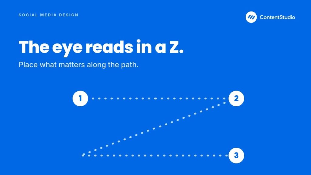
People scan predictable paths across a design. Placing your key elements along those paths- the upper-left, the natural reading line, the point where the eye exits- means your most important content gets seen without the viewer having to hunt for it.
For text-heavy visuals like infographics, this matters even more. Arrange information so it reads in a logical sequence, and the viewer can follow it without backtracking.
When the flow matches how people actually look at a screen, comprehension goes up, and frustration goes down. Design that fights the eye loses; design that follows it wins.
Every post is a chance to reinforce who you are. Use the same fonts, the same color palette, and the same image style across your content so that your feed reads as one coherent brand rather than a series of unrelated posts. Consistency is what makes your content recognizable even when your name is not visible.
The way to sustain this at scale is to standardize. Decide your fonts, your exact color values, your logo placement, and your imagery approach, then apply them every time. Templates make this dramatically easier, which is why they appear later in this list.
Each platform has its own recommended dimensions, and those recommendations change over time. Designing to the correct size prevents your visuals from being cropped awkwardly, stretched, or downgraded in quality.
A design that looks perfect in your editor can be ruined by an automatic crop if it was built to the wrong ratio.
Because this is such a common and costly mistake, the next major section of this guide is devoted entirely to current sizes and specs across platforms. The short version: know the aspect ratio and resolution for the format you are publishing before you start designing, not after.
There will always be moments when you need to publish quickly, and that is exactly when consistency tends to slip. Templates solve both problems at once. A set of reusable, on-brand templates lets you produce polished content fast while guaranteeing that every post follows your visual system.
Effective templates include a defined space for your main visual, supporting elements, editable text areas, your logo, and your color palette locked in. Once built, they turn design from a from-scratch effort into a fill-in-the-blanks task, which is what makes consistent daily publishing sustainable.
Where your visuals come from matters. Using images, fonts, or templates without the right to do so can create real legal and reputational problems. Before you use an asset, check its license and usage terms, and when in doubt, choose sources that are clearly cleared for commercial use or create your own.
Crediting matters too. When you feature content created by others, especially user-generated content, give credit to the original creator. It is both the ethical choice and one that builds goodwill with the people whose work you are amplifying. A disciplined approach to sourcing protects you and reflects well on your brand.
Design is not a set-and-forget craft. The platforms give you feedback in the form of engagement data, and that data tells you which visual approaches resonate and which fall flat.
On most feed-based platforms, a post does much of its work within the first day or two, so you get fast, actionable signals if you pay attention. Some formats, like short video or Pins, can keep building for far longer, so read the timing against the platform.
Use platform analytics to track how different designs perform. Test variations against each other and see which layout, color treatment, or format wins. Establish a sense of what your best and worst posts have in common visually.
Getting dimensions right is one of the least glamorous but most important parts of social media design. The wrong size means your carefully built graphic gets cropped mid-headline, your video shows black bars, or your image is compressed into a blurry mess.
Platforms update their recommended sizes periodically, so treat the numbers below as current-generation guidance and confirm against each platform when precision matters. A quick note on how sizing works. Two things matter: aspect ratio (the shape, like 1:1 square or 9:16 vertical) and resolution (the pixel dimensions).
The aspect ratio determines whether your design fits the frame without cropping. The resolution determines how sharp it looks. Designing at the recommended resolution, in the correct ratio, gives you both.
The table below covers the most common static image formats and the recommended social media image sizes for each. When a platform accepts a range, the higher resolution generally displays better on modern high-density screens.
| Format | Aspect ratio | Recommended size (px) | Best used for |
| Square post | 1:1 | 1080 x 1080 | Universal feed posts, quote cards, product shots |
| Portrait post | 4:5 | 1080 x 1350 | Feed posts that maximize vertical screen space |
| Landscape post | 1.91:1 | 1200 x 628 | Link previews, wide banners, some feed posts |
| Vertical story / full screen | 9:16 | 1080 x 1920 | Stories and full-screen vertical formats |
| Profile picture | 1:1 | 400 x 400 (min) | Avatars across platforms |
| Cover / header image | varies | 1500 x 500 to 1920 x 1080 | Profile banners and channel art |
The portrait 4:5 ratio deserves special mention. On mobile-first feeds, vertical formats occupy more screen real estate than square or landscape, which means more visibility and often more engagement. When in doubt about a standard feed post, 1080 x 1350 is a strong default.
Video has its own set of dimensions, plus additional video specs like length, frame rate, and file format that images do not. The table below covers the main formats.
| Video format | Aspect ratio | Recommended size (px) | Typical length |
| Vertical / short-form (Reels, Shorts, TikTok) | 9:16 | 1080 x 1920 | Up to 60-90 seconds for best reach |
| Square video | 1:1 | 1080 x 1080 | Flexible, good for feed |
| Landscape / horizontal | 16:9 | 1920 x 1080 | Long-form, tutorials, wide platforms |
| Vertical story | 9:16 | 1080 x 1920 | Up to 60 seconds per segment |
For technical specs, most platforms handle the common standards well: MP4 with H.264 encoding, a frame rate of 30fps (or 60fps for smoother motion), and AAC audio. Keep file sizes reasonable, because heavy files can be compressed harder by the platform, which degrades quality.
Instagram Reels and video sizes
Instagram video sizing is a frequent point of confusion because the platform supports several formats. Here is the practical breakdown:
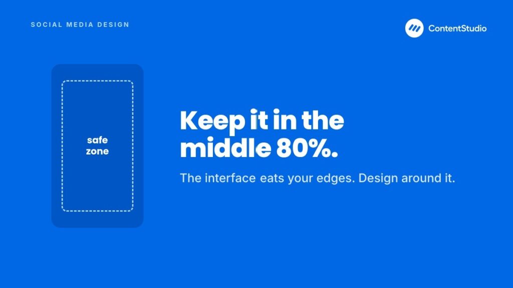
The safest single approach for Instagram is to design vertically at 1080 x 1920 and keep your key content within a central “safe zone,” roughly the middle 80 percent of the frame, so nothing important gets clipped by interface elements or repositioned when the same asset is reused across formats.
You design a social media post in six steps: define the goal and message, choose the format and platform, gather and prepare your assets, build the layout, add motion or captions if needed, then export, preview, and schedule.
Following the same repeatable order every time is what makes design faster and more reliable, whether you are making one graphic or a batch.
Before opening any tool, get clear on what this specific post is for. Is it meant to drive clicks, build awareness, spark a conversation, or showcase a product?
The goal shapes every design decision that follows, from the format to the call to action. Then distill the message to a single sentence. If you cannot state what the post is about in one clear line, the design will not be clear either.
This step feels obvious and is routinely skipped, which is why so many posts look busy and say nothing. A minute of clarity here saves an hour of redesigning later.
Match the format to the goal and the destination. A quick tip might be a single graphic. A process is a carousel. A demonstration is a short video. A data point is an infographic snippet. At the same time, decide which platform this is primarily for, because that determines your dimensions and the tone your audience expects there.
If the post is going to multiple platforms, decide now whether you are building one flexible asset or platform-specific variants. Making that decision up front prevents rework.
Collect what you need: photography, product images, icons, illustrations, or footage. This is the stage to clean up your raw materials, which often means removing distracting backgrounds from product shots, color-correcting photos, or cropping images to focus on the subject.
Strong source material is what makes the difference between a flat feed and one built on engaging images, so starting with clean, high-quality visuals makes everything downstream easier and better.
If you are working with user-generated or third-party content, confirm you have the rights to use it and note any credit you need to give. Handling this now avoids problems after the post is live.
Now you compose. Place your hero element first, establish your hierarchy, add supporting text, and position your call to action where the eye naturally lands. Apply your brand colors and fonts.
Keep the layout clean, respect white space, and check that your contrast keeps everything readable. This is where the principles from earlier become concrete choices.
If you have a template for this format, this step is mostly filling it in, which is exactly why templates are worth building. Starting from a template also keeps you from reinventing your hierarchy and spacing every single time.
For video, this is where you add on-screen text, captions or subtitles, transitions, and any motion graphics. For static posts, this might mean a subtle animated element or a GIF version. Captions in particular are not optional for video, since a large share of social video is watched without sound. Text on screen makes your content accessible and keeps silent viewers engaged.
Export at the correct resolution and format for your destination. Then preview the post as it will actually appear in the feed before it goes live, because the way an asset looks in your editor is not always how it looks in the real interface. Once you are satisfied, schedule or publish it.
Using a social media management platform to preview and schedule across accounts saves significant time and reduces the risk of format mistakes slipping through, since you can see and adjust each version in one place.
You design engaging social video by treating motion, pacing, sound, and on-screen text as design elements, not extras, and by winning the first few seconds with a strong hook.
Lead with your best visual, keep something changing on screen, and caption everything, since a large share of social video is watched with the sound off.
Short-form vertical video is the dominant format for discovery on most major platforms, and learning to produce short-form video content rewards a specific kind of design thinking.
The opening moment has to earn attention immediately, because viewers decide almost instantly whether to keep watching. Lead with your strongest visual or a hook that creates curiosity, and avoid slow intros that give people a reason to scroll away.
Pacing matters throughout. Short-form video keeps viewers engaged through movement, quick cuts, and a sense of momentum. Design your clip so something changes on screen regularly, whether that is a cut, a text overlay appearing, or a visual transition.

A large portion of social video is watched with the sound off, especially in public settings and passive scrolling. Without captions, that audience gets nothing from your spoken content.
Taking the time to add captions and subtitles to your videos makes them work silently, which dramatically widens the number of people who actually absorb your message.
Captions are also an accessibility necessity, ensuring viewers who are deaf or hard of hearing can engage fully with your content. Beyond that, they tend to increase watch time even for viewers with sound on, because reading along keeps people anchored to the video.
Design your captions to be legible: a clear font, sufficient contrast against the footage, often with a subtle background or outline so text stays readable over busy visuals.
Not all social video is short and vertical. Long-form horizontal video suits tutorials, interviews, in-depth explainers, and platforms where viewers expect to settle in. The design priorities shift here.
Design long-form video with signposting: title cards, section markers, and lower-third text that orient the viewer and break the content into digestible parts. Maintain your brand identity through consistent colors, fonts, and intro or outro elements so the video feels like part of your library rather than a one-off.
Treat the thumbnail with the same care as any feed graphic, because it functions as one. When you plan and produce video content in one place, it becomes far easier to keep these branded elements consistent across everything you publish.
Also read: Video marketing strategy
GIFs and simple animation sit between static images and full video, adding movement and personality without the production weight of a real video. Because motion draws the eye in a feed of still images, a short looping GIF can catch attention fast.
Use them for quick, silent, looping moments; use video for anything richer. Used well, GIFs for social media make a brand feel more alive and approachable.
GIFs shine when you want quick, lightweight motion that loops seamlessly and needs no sound. They are ideal for reactions, small demonstrations, subtle animated highlights, and adding a touch of humor or energy.
Because they loop automatically and play without a tap, they can catch attention faster than a video that waits to be started. A GIF is the wrong choice when you need audio, longer content, or high visual fidelity, since the format is limited in color depth and length.
If your idea needs sound or runs beyond a few seconds, use video instead. The design instinct here is to match the format to the job: GIFs for short, silent, looping motion; video for anything richer.
To create a GIF, you usually start with either a short video clip or a sequence of images that you convert into a looping animation. The keys to a good one are keeping it short, making the loop feel smooth so there is no jarring jump when it restarts, and keeping the file size manageable so it loads quickly.
A GIF that stutters or takes too long to load undermines the effect entirely. From a design standpoint, treat a GIF like any other branded asset.
Keep it consistent with your color palette and style, add your logo or mark if appropriate, and make sure any text stays on screen long enough to read within the loop.
Captions, emojis, and text formatting shape your design because they are part of the visual experience, not separate from it.
A caption’s line breaks, a well-placed emoji acting like a bullet, and selective bold text all affect readability, tone, and how polished the post feels. Treated with the same care as the image, they lift the whole thing.
Emojis are a form of visual shorthand. Used deliberately, they add warmth, break up text, signal tone, and draw the eye to specific lines. A single emoji at the start of a key point acts almost like a bullet, guiding the reader through the caption, which is why learning to add emojis in your captions with intent can make a block of text feel friendlier and less like a wall of words.
The design discipline is restraint and relevance. Emojis should match your brand voice; a playful brand can use them liberally, while a more formal one should use them sparingly or not at all. Avoid scattering them randomly or using so many that they clutter the message.
Formatted text, including bold, can add emphasis and structure to a caption, making it easier to scan and helping key phrases stand out. Because most social platforms do not offer native bold formatting in captions, the usual way to make captions bold is with special Unicode characters that appear bold across devices.
Used carefully, bold text can highlight a headline within your caption, emphasize an offer, or make a long caption easier to navigate.
The caution is that these formatted characters are not read the same way by screen readers, which can hurt accessibility, and overusing them makes a caption look gimmicky. Reserve bold for genuine emphasis: a single key line, a heading, or a critical detail.
You refine images for social media with a few core edits that need no advanced skill: remove the background to place a subject on a clean brand backdrop, crop to the right subject and aspect ratio, then correct exposure, colour, and contrast.
A consistent treatment across every image is what gives a feed its cohesive, deliberate look.
Being able to remove a background from an image is one of the most common and useful edits in social media design. It lets you place a product or subject cleanly onto a branded backdrop, build composite graphics, and create consistent product shots without a studio.
A cutout subject on a solid brand-colored background is a staple of professional-looking feeds. Modern tools make background removal nearly automatic. Most image editors and many design platforms can detect the subject and strip the background in a click, leaving you with a transparent PNG you can drop onto any layout.
For clean results, start with an image where the subject stands out clearly from its background, since busy or low-contrast originals are harder for automated tools to cut precisely.
Beyond background removal, a handful of adjustments elevate most photos. Cropping to focus on the subject and to hit the correct aspect ratio is the first and most important. Correcting exposure and color so the image looks natural and consistent with your other content comes next.
Adjusting contrast and sharpness can make an image feel crisper and more intentional. The goal of editing is not to make images look heavily processed, but to make them look clean, consistent, and deliberately yours.
When all your images share a similar treatment, whether that is a consistent brightness, a color tone, or a filter approach, your feed gains the cohesive look that signals a thoughtful brand. Editing is where consistency is quietly enforced.
The way a post looks in your design tool is not always how it looks in the actual feed. Platforms crop, compress, and reformat, and interface elements can overlap parts of your design. Previewing a post as it will genuinely appear, before it goes live, catches these problems while you can still fix them.
A preview shows you whether your image is cropped correctly, whether text sits in a safe zone, whether the caption reads well, and whether the whole thing looks the way you intended on the platform it is destined for.
The habit of taking a moment to preview your posts before publishing is especially valuable when you publish the same content across multiple platforms with different display rules.
Also read: The best online tools to create social media graphics
The tool you design in shapes how fast you work and how consistent your output is. Rather than chasing a single “best” tool, the smarter approach is to understand the categories of tools available and match them to your needs, your skill level, and your workflow. Here is how to think it through.
Social media design tools fall into a few broad categories, and most people end up using more than one:
When you evaluate a design tool, weigh it against a few practical criteria rather than a long feature list:
Free tools are enough for most individuals and small brands: a good free template library can produce consistent, professional content at modest volume.
The limits show up as fewer templates, restricted brand controls, watermarks or export caps, and limited collaboration. Paid tiers earn their cost when volume, teamwork, or managing multiple brands grow.
Design tools create the assets. A social media management platform handles what happens next: previewing each post in its real format, scheduling across accounts, publishing at the right times, and measuring performance.
The two work together. You design the content, then use the platform to make sure it looks right on every destination and goes out on schedule.
The advantage of consolidating the surrounding workflow is that it removes the gaps where mistakes happen. Instead of exporting from a design tool, guessing how it will crop, and posting manually to each platform, you can preview accurate versions, adjust, schedule, and later review analytics in one place.
You measure and improve social media design by watching the metrics that actually reflect it: engagement rate, saves and shares, and for video, watch time and completion rate.
Then test one design variable at a time and keep a simple record of what wins. Over time this turns design from guesswork into a discipline that compounds.
Not every metric reflects design quality, so focus on the ones that do. Engagement rate shows whether your visuals are compelling enough to prompt a reaction. Saves and shares indicate that a design delivered enough value for people to keep or spread it.
For video, watch time and completion rate reveal whether your pacing and on-screen design held attention. Click-through rate tells you whether your call to action and hierarchy successfully drove the intended action.
The most reliable way to improve is to test one variable at a time. Try two versions of a post that differ in a single design element the color treatment, the headline placement, the format and see which performs better. Because most social content reaches its peak engagement within a day or two, you get fast feedback that you can act on quickly.
Keep a simple record of what you learn. Over time, these small tests accumulate into a genuine understanding of what your specific audience responds to, which is far more valuable than generic best practices.
Establishing benchmarks from your own best and worst performers gives you a realistic bar to measure new content against. This is how design stops being guesswork and becomes a discipline that compounds.
Even experienced creators fall into predictable traps. Knowing them in advance is the easiest way to raise the quality of your content. The most common mistakes include the following:
Social media design is not decoration added at the end of the process. It is the first thing your audience experiences and often the deciding factor in whether they engage at all. In a feed crowded with content, the brands that get noticed are the ones whose design is clear, consistent, and unmistakably their own.
The good news is that strong social media design is learnable and, more importantly, repeatable. Start with the fundamentals, apply them consistently, and let your analytics guide your refinements.
The brands that stand out are rarely the ones with the biggest budgets. They are the ones whose design is coherent, intentional, and consistent enough to feel like a single confident voice, post after post.
The easiest way to manage and grow your social channels.
Social media design is the process of planning and creating the visual elements that represent your brand across social platforms, including images, graphics, infographics, videos, GIFs, and the formatting of captions.
A good social media design combines a clear single message with strong visual hierarchy, consistent branding, and readability on small screens. It uses a deliberate color palette with enough contrast to guide the eye, respects white space so the design does not feel cluttered, and is sized correctly for its platform.
Start with a single clear idea and build the design around it. Use high-quality visuals, a consistent color palette and font, and strong contrast to make key elements stand out. Keep the layout simple with plenty of white space, size the post correctly for its platform, and add value through useful or entertaining content rather than decoration alone.
Common recommended sizes include 1080 x 1080 pixels for square posts, 1080 x 1350 for portrait feed posts, 1200 x 628 for landscape and link previews, and 1080 x 1920 for full-screen vertical formats like stories.
Vertical short-form video, including Reels and similar formats, should be 1080 x 1920 pixels at a 9:16 ratio. Square video is 1080 x 1080, and horizontal long-form video is typically 1920 x 1080 at 16:9.
Yes. A large portion of social video is watched with the sound off, so uncaptioned video fails to communicate to a significant share of its audience. Captions also make your content accessible to viewers who are deaf or hard of hearing, and they tend to increase watch time even among viewers who have sound on.
Most creators use a combination: an all-in-one design platform with templates for graphics, a video editor for motion content, and a social media management platform for previewing, scheduling, and analytics. You do not need every tool at once.
Templates encode your visual system, your fonts, colors, logo placement, spacing, and hierarchy, into a reusable structure, so producing on-brand content becomes a matter of filling in new content rather than designing from scratch.
How do I keep my social media design consistent?
Keep social media design consistent by deciding your fonts, exact colour values, logo placement, and image style once, then locking them into reusable templates. Templates turn each post from a blank canvas into a fill-in-the-blanks task, so the look holds even when you publish fast or more than one person is creating.
Can I use the same design on every platform?
You can reuse one design across platforms, but only if you build it to survive different crops. Design vertically at 1080 by 1920 and keep the important content inside the central safe zone, roughly the middle 80 percent of the frame.
Plan 0 Days of Content in 0 Minutes
Create, schedule, publish and analyze your content across all your social media channels from one simple dashboard.
4.7 on Capterra • 16,500+ marketers trust ContentStudio
Saif Ali is a Content Marketing Strategist at ContentStudio with over five years of experience across SaaS, IT, and digital marketing. He specializes in SEO-led content, AI content creation, and social media strategy, and leads editorial review at ContentStudio, fact-checking and refining articles for accuracy, SEO, and a consistent brand voice.
View all posts by Saif AliRecommended for you
How to promote affiliate links on social media in 2026
Multi-location social media management workflow guide

Best SaaS affiliate programs for social media marketers in 2026
19 best social media management tools to plan, schedule, and grow in 2026