
95% of marketers use AI. Only 39% see better performance. The gap isn’t the AI
Oct 7, 20268 minutes

Written by
Esha ShabbirUpdated
Brand identity is the visual and verbal system that makes your business recognizable. It’s your logo, colors, typography, imagery, and voice, all governed by documented guidelines. Every touchpoint your audience encounters is an expression of it.
This is what makes someone recognize your brand on Instagram before they’ve read your name. Get it right, and every channel reinforces the same impression. Get it wrong, and you’re starting from zero every time someone new finds you.
This guide covers what brand identity actually consists of, how to build one, and what it takes to keep it consistent when you’re producing content at scale.
Brand identity is the visual and verbal system that makes your business recognizable: your logo, colors, typography, imagery, and voice, all governed by documented guidelines. It is the part you design, document, and control. It is not what people think of you. It is the deliberate set of signals you send so they think of you consistently.
Three terms in this space often get used interchangeably. They mean different things.
| Term | What it means |
| Brand identity | The design and language choices you create and control. Your logo, colors, typography, imagery, and voice. The execution layer. |
| Branding | The strategic process of defining what your brand stands for and how it should be positioned in the market. Strategy comes first. Identity executes it. |
| Brand image | What your audience actually thinks about your brand, shaped by their accumulated experiences with it. You influence it through your identity. You don’t control it directly. |
When a brand isn’t performing the way it should, the diagnosis depends on knowing which layer is broken. If the visual identity is strong but the brand image is poor, the problem is usually in execution. If the identity is hard to maintain at scale, the problem is usually in the system itself. It’s not documented specifically enough to hold across contributors and channels.
Brand identity matters because a consistent one shapes how people perceive, price, and buy from you before they ever speak to your team. It builds recognition that compounds, lets you charge more for the same product, and makes every ad work harder. An inconsistent identity resets that trust with each encounter, so familiarity never turns into preference.
The key elements of brand identity are six: your logo, color palette, typography, brand voice and tone, imagery style, and the visual system that ties them together. People often call these the five pillars and leave out the visual system. They only work together. A logo in isolation is not an identity, and a palette without type rules is only half a system.
All need to exist, be documented, and be applied consistently.
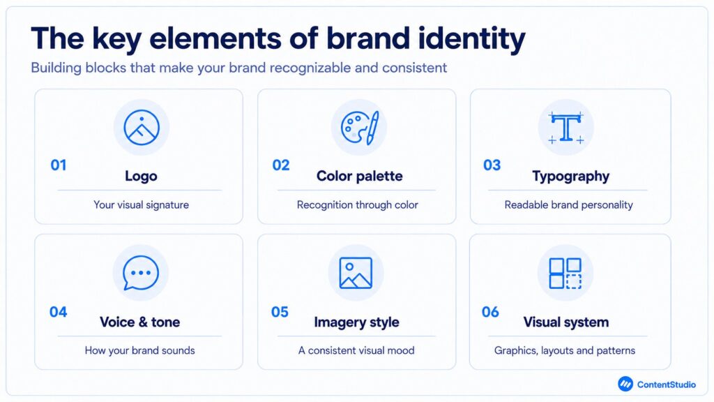
Your logo is the element your audience encounters most often and retains longest. It doesn’t need to explain what you do. It needs to be simple, versatile, and consistent enough to work across every context.
At minimum, your logo system should include three variants, each tested in full color and in black and white:
On social media, your logo most often appears as a 40-pixel circular profile image. That’s the most common first impression. If the primary logo doesn’t work at that size, the standalone icon variant needs to carry it on its own.
Simple logos become iconic through years of consistent use, not through symbolism. The Nike swoosh doesn’t communicate athletic performance. It communicates Nike, because it’s been seen a billion times in the right contexts. That’s how logo meaning is built.
A good logo solves a recognition problem, not a storytelling problem. The story gets told through everything else in the system.
Color is processed faster than text and retained longer than most other visual elements. Your palette is often the first brand signal people register.
Build a primary palette of two to four colors. Develop secondary accent colors for specific contexts. Document exact hex codes, RGB values, and CMYK codes so colors stay consistent across digital and print.
A brand color that shifts by a few hex values between your social graphics and your website creates a visible inconsistency, even when it reads as subtle in isolation. These discrepancies compound as more people produce content from memory rather than from documented specs.
Color associations carry cultural weight. These are conventions, not laws, but breaking them requires a clear strategic reason tied to positioning.
These associations are conventions, not rules. They matter far less than consistency: a brand that owns one unexpected colour and uses it everywhere will out-recognize a brand that picks the “correct” colour and applies it loosely.
Font choices communicate personality as directly as color. Serif typefaces read as traditional and authoritative. Sans-serif as clean and modern. Script as warm and expressive.
Choose a primary typeface for headings and a secondary for body copy. Test both at small sizes on mobile, where the majority of your social media content gets consumed. If a font doesn’t read cleanly at 12px on a phone screen, it’s a problem waiting to surface in production.
Typography on social media also includes text overlaid on graphics, story frames, and carousel slides. These need to be legible against whatever background they appear on, not just aesthetically consistent with the brand.
Limit the system to two typefaces. Every additional font is one more element that can drift. Document licensing clearly, too. If a typeface requires a commercial or web license, that information needs to be in the brand guidelines.
Brand voice is the consistent character in your writing. It’s how you think, what you care about, and how you communicate with people regardless of the topic.
Tone is how you modulate that character depending on context. Your voice stays constant. Your tone shifts. More direct in a complaint response, lighter in a story caption, more considered in a long-form article.
Voice guidelines need specific examples to be operational. Abstract descriptions like “be warm and approachable” tell a contributor nothing usable. A guide that shows what the brand does and doesn’t sound like, applied to real content formats. Captions, reply comments, email subjects, bio copy. That’s what’s usable.
The guide should also include negative examples. Showing contributors what the voice doesn’t sound like is often more clarifying than showing them what it does. Side-by-side comparisons of on-brand and off-brand copy for the same situation are more actionable than any description.
Your voice shows up in the smallest touchpoints. These are all consistency tests that most brands underinvest in.
Your imagery style is the visual language of your photos, illustrations, or graphics. It shapes brand recognition in feeds where your logo isn’t visible, which is most of the time on social media.
Define it explicitly. Do you use saturated or muted photography? Real people in real settings, or clean product visuals? Photography, illustration, or a mix? Document the guidelines with actual visual examples, not just descriptions.
Imagery is the element that drifts most often without anyone noticing. One contractor with a slightly different visual instinct, one post produced under time pressure from the wrong reference. That’s how imagery drift starts.
Without explicit documented guidelines, there’s nothing to course-correct against when it happens. And it will happen. Audit your imagery quarterly.
Your visual system is everything beyond the logo that makes content recognizable: icon styles, graphic treatments, patterns, image overlays, and shape systems. Think of Spotify’s duotone photos or Mailchimp’s illustration style. These create continuity where the logo is not the focal point, so your work reads as one brand even when the logo is cropped out.
Spotify’s duotone photo treatment. Mailchimp’s illustration style. Netflix’s gradient-heavy graphic language. These elements make brands recognizable even when the logo is absent. Building that layer into the identity is what produces a visual system rather than a collection of branded assets.
A well-built visual system means your content looks like it came from the same brand even when the logo is cropped out, the color displays slightly differently on a particular screen, or a contractor is producing creative without direct oversight.
Your brand guidelines are the document that makes everything else operational. They allow other people to produce on-brand content without your direct involvement on every piece. A complete guidelines document covers:
Include the reasoning behind the rules, not just the rules. When contributors understand why a decision was made, they apply it correctly in situations the document didn’t anticipate.
Keep the document current. Update it when the brand evolves, when new platforms require new templates, when color codes need adjustment for new format specs. Outdated brand guidelines breed inconsistency with the authority of a document, which is worse than informal standards in some ways.
A good brand guidelines document is also a training tool. Every new team member or contractor who touches the brand should be briefed on it before producing anything. That briefing prevents institutional brand knowledge from eroding as teams change. The standard lives in the document, not in anyone’s head.
You build a brand identity in five steps and in this order: research your audience and competitors, define your brand strategy, build the visual elements in sequence, write your voice guidelines, then document everything before you scale. The order matters more than most people expect, because each decision sets the constraints for the one after it.
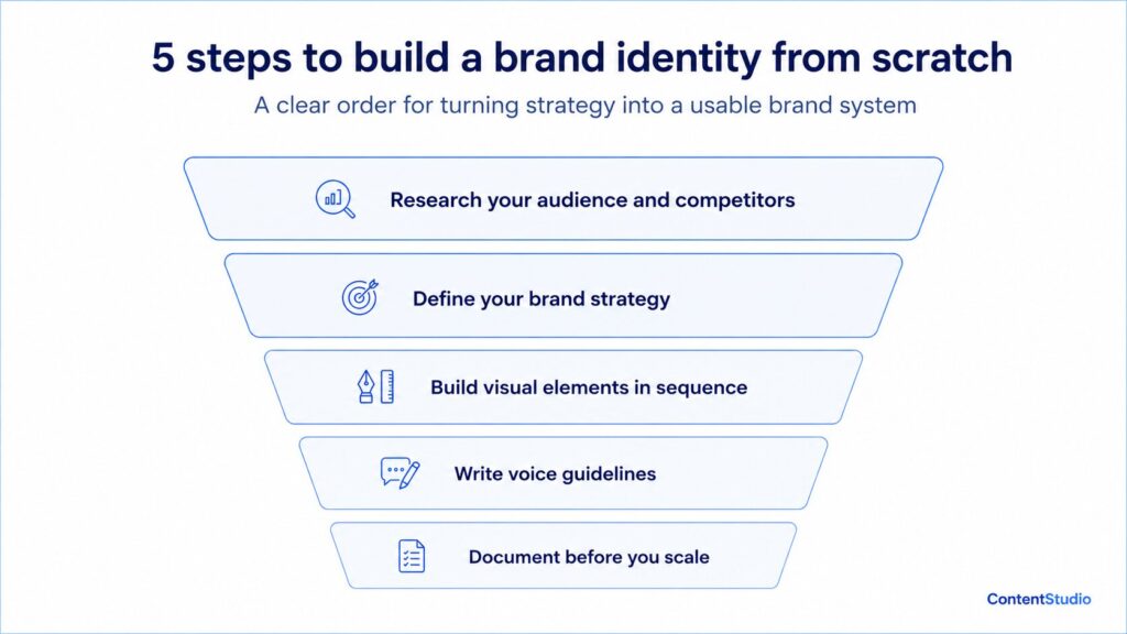
Before any design decisions, you need two pieces of clarity. Who you’re designing for, and what competitors in your space are already doing.
Audience research means understanding what visual signals your target audience trusts and what aesthetics they respond to on the platforms where they spend time. The goal isn’t to imitate the brands they already choose. It’s to understand the visual language they’re fluent in, so you know where to speak it and where to break from it.
Competitor mapping means identifying visual white space. If everyone in your category uses dark navy and heavy sans-serif type, the distinctively visible move is a different direction. You’re designing for context, because your brand will always be encountered in the context of alternatives.
Look for what no competitor does well, not just what no one is doing. A gap in execution quality is as valuable as a gap in approach.
Your brand identity visualizes your brand strategy. The strategy has to exist before the design does. That means clarity on your mission, values, market positioning, and how you want people to feel when they interact with your brand.
This is also where your brand narrative takes shape. The story of why your company exists, what it stands for, and what makes it different from every alternative is the foundation your visual and verbal identity expresses.
Without a clear strategy, the identity will feel arbitrary. Because it will be.
Try it out: Brand story generator
Start with the logo. Once established, develop the color palette to complement and extend it. Then typography. Then imagery style. Then the supporting visual system.
Each decision reinforces the ones before it. The color palette should feel like it belongs to the same brand as the logo. The typeface should feel like it belongs to the same brand as the color palette.
Test every element in real contexts, not just in a design file. The logo as a 40-pixel social avatar. The colors on a phone screen in daylight. The typography at caption size on Instagram. Problems invisible in a design environment appear quickly in real-world application.
Voice guidelines that are abstract don’t get applied consistently by multiple contributors. “Be direct and human” tells someone nothing actionable. A guide that shows what direct-and-human sounds like in a product caption, in a complaint response, in a DM reply, in a newsletter subject line. That’s what’s usable.
The guide should also show what the voice doesn’t sound like. Negative examples are often more clarifying than positive ones.
A voice guide without a narrative foundation is just style rules. A documented brand storytelling approach gives your voice a consistent point of view, so it sounds like it comes from the same place regardless of who wrote it.
A brand identity that lives only in the founder’s head or in one designer’s Figma file is an identity waiting to break. Document your guidelines before a second contributor touches the brand.
At minimum, write down:
Document it while it’s fresh, not after drift has already happened and you’re trying to reconstruct what the standard was supposed to be. A brand guidelines document written after the fact is usually less specific than one written alongside the design process, because the reasoning behind decisions fades faster than the decisions themselves.
Brand voice is the verbal layer of your identity: the consistent character in your writing that stays the same regardless of format, platform, or who is producing the content. For a social media brand, it is often the primary point of contact. Your visual identity earns the stop. Your voice decides whether people read through, engage, and come back.
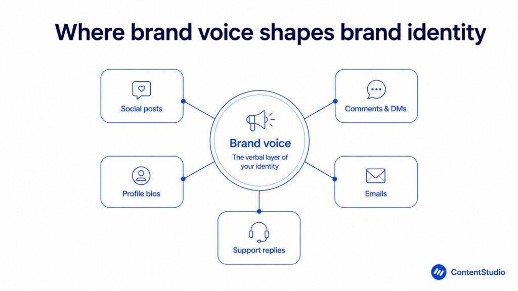
For a social media brand, voice is often the primary point of contact. Your visual identity earns the stop. Your voice determines whether they read through, engage, and return. These are different problems requiring different disciplines.
A brand with a defined voice sounds the same whether a post was written by the founder or a contract writer. A brand without one sounds like whoever wrote it that day.
Voice shows up in every written touchpoint, not just the ones that feel like marketing. All of these are consistency tests:
A brand that sounds warm and specific in its content but generic and defensive in its replies is showing two faces to the same audience.
For agencies managing multiple client voices simultaneously, the documentation requirement is even more demanding. Every client needs a voice guide specific enough that the same writer can produce distinctly different-sounding content for two clients back to back, without bleeding one into the other.
As content volume grows, automating brand voice on social media becomes necessary to maintain consistency. Manual review alone can’t keep up at scale. A documented voice is also what authentic brand expression on social media actually requires. It’s the product of consistent standards applied over time, not a tone setting.
Visual identity shapes recognition because people process images faster than words: your colour, logo, and layout register before a single word is read. When those signals stay identical across every post, each impression compounds into familiarity, which is what recognition actually is.
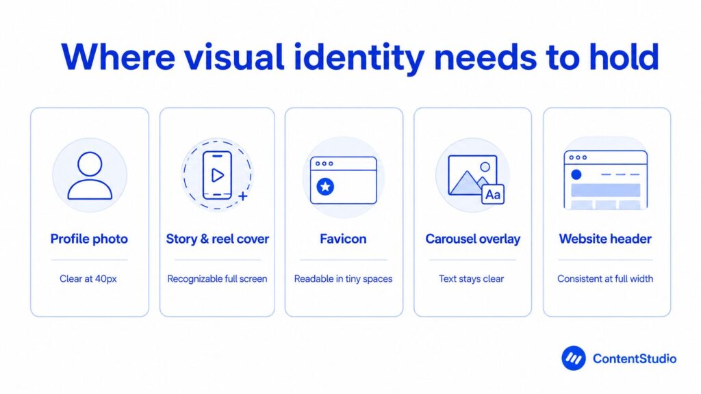
A strong visual identity works at every size and in every context. If it doesn’t hold at small sizes or in monochrome, it’s incomplete. Test yours across the touchpoints where it gets used most:
The most recognizable brands have visual systems, not just logos. A logo is one element. A visual system is the full toolkit. Logo, colors, typefaces, imagery style, and graphic treatments, all interacting consistently across every surface.
When that system is coherent, the brand is recognizable even when the logo isn’t present. That’s the goal. A visual language so specific to your brand that the audience identifies you without needing to see the logo.
For social media specifically, visual identity also needs to hold across formats that didn’t exist when most brand guidelines were written. Grid posts, stories, reels, carousels, shorts. Each format has different dimensions, different viewing contexts, and different audience behaviors. A visual identity designed only for static posts tends to look generic or incomplete in video and short-form formats.
Your brand’s social media profile is often the first visual impression someone has of your brand. Profile photo, cover image, bio, pinned content. All of it forms an impression before someone reads a single post. These aren’t form fields. They’re identity decisions.
Brands that maintain visual consistency for years build a recognition advantage that newcomers can’t shortcut with budget. The advantage is time-based. It only exists because of sustained, consistent execution.
You maintain brand identity on social media with three things: a template system so every contributor starts from the same approved format, a central asset library holding current brand files, and a review step before anything goes live. Social media is where identity gets tested at real volume, and without all three it drifts as output grows.
More touchpoints mean more opportunities for drift. More people producing content mean more chances for the brand to look or sound like something it isn’t. The challenge isn’t conceptual. It’s operational.
Visual consistency doesn’t mean every post looks the same. It means every post looks like it came from the same place.
The operational requirements are three. A template system so all contributors start from the same approved format. A centralized asset library containing current, approved brand files, not a shared folder with seven logo versions from different years. And a review step before content goes live.
Without all three, visual drift is almost certain at volume. One person working from an outdated template, one post produced from memory rather than from the asset library. These are where inconsistencies enter.
Your brand’s social media presence is built post by post. Each one either reinforces the brand or introduces a small inconsistency. Those inconsistencies compound.
Visual inconsistency is visible to anyone who scrolls your feed. Voice inconsistency is subtler but equally corrosive over time.
A brand whose captions are warm and specific but whose comment replies are generic is presenting two different identities to the same audience. Platform tone should adapt to the channel. Brand voice should not shift at all.
Can a new contributor produce an on-brand comment reply or caption using your voice guide alone, without asking for examples? If the answer is no, the guide isn’t specific enough to hold.
Platform tone should adapt to the channel. A LinkedIn post carries a different native register than an Instagram caption. But the underlying brand voice should not change to match the platform. Your voice is what you say. Your tone is how you modulate the delivery. Both matter. Only one should shift per platform.
Four patterns account for most brand identity drift on social media.
These are the common social media mistakes that quietly erode brand equity. The fix is almost always operational, not creative. And when a social media crisis hits, any pattern that wasn’t addressed beforehand gets exposed under pressure.
For agencies, the challenge multiplies. The primary risk is brand bleed. That’s the visual and tonal similarities that creep across client accounts when the same team produces content without specific enough briefs for each.
Preventing it requires separate asset libraries per client, voice documents that are distinct enough to require genuine switching, and a production review that checks content against the right brand standard before it leaves the team.
You audit your brand identity by pulling 60 days of published content across every channel and looking at it together in one grid: social posts, emails, ads, website pages, and comment replies.
Patterns that are invisible post by post become obvious at scale. Drift is gradual, so run this quarterly, before small inconsistencies harden into a full reset.
Pull 60 days of published content across every channel and look at it all together in a grid. Social posts, email campaigns, ads, website pages, comment replies. Patterns invisible post-by-post become obvious at scale.
Run through this checklist when reviewing:
Ask several team members independently to describe your brand voice. If the answers diverge, the guidelines aren’t specific enough to hold across contributors.
A brand identity audit isn’t a one-time exercise. Running it quarterly, before it becomes urgent, is what keeps small drift from becoming a structural inconsistency that requires a larger reset to fix.
The clearest brand identity examples each solved one problem at scale. Glossier built for mobile photography, Mailchimp got playful in a category that is usually dry, Notion turned its aesthetic into a format people copy, and Patagonia tied every visual choice to its values. What they share is not fame. It is specificity applied consistently for years.
Glossier built its identity around one brand truth. Beauty should feel effortless and real. The millennial pink palette, the minimalist packaging, and the UGC-forward content strategy all express the same idea.
What’s worth studying is that the visual identity was designed with mobile photography in mind. The packaging photographs well under natural light. The color palette works with selfie-scale content. Physical and digital identity were built as one brief, not adapted separately.
The strategic social media partnerships Glossier built reinforced the same identity signals. Real people, peer-to-peer, community-led. Every collaboration extended the identity brief rather than departing from it.
Mailchimp built a distinctive identity in a category that’s uniformly technical and dry. Playful illustration style, a specific shade of yellow, and a brand voice that’s simultaneously helpful and slightly absurd made them recognizable in a way competitors with more features couldn’t match.
Mailchimp’s recognition grew because the identity was distinct enough to generate word-of-mouth. Measuring the power of social data over time shows the same pattern consistently. The brands with the highest recall are almost always the ones with the most specific, consistently applied identities.
Mailchimp didn’t win on features alone. They won because people remembered them. And they remembered them because the identity was specific enough to be distinct.
Notion built its brand identity primarily through social media, not advertising. Clean, minimal aesthetic. A typeface so strongly associated with the product that “Notion-style” became its own visual reference independent of the brand name.
The visual consistency came from Notion’s own content modelling what the product enables. Organized, clear, structured thinking. The identity and the product experience pointed in the same direction.
Users adopted the visual aesthetic as part of their own content. Notion-template posts became their own content category. That’s the outer edge of brand identity success. Your identity is working when people use it to express themselves, not just to identify you.
Patagonia’s identity is inseparable from its values. Every visual choice reinforces the environmental commitment that defines the brand’s positioning. Any departure from that aesthetic would read immediately as inauthentic.
Patagonia also shows what a reputation management strategy looks like when it’s built into the brand identity rather than treated as a separate function. What they say and what they do point in the same direction, consistently.
The touchpoints teams most often overlook are the ones that do not feel like marketing: comment replies and DMs, customer service interactions, the partners you choose, and what employees post about their work.
Each one either reinforces the identity your official channels build or quietly contradicts it. Brand identity extends to every interaction, not just content.
Brand identity is not a deliverable you produce once. It’s a standard you maintain continuously.
Every brand that has ever been called iconic got there the same way. Not through a single brilliant campaign or a perfectly designed logo. Through showing up the same way, across every channel, for long enough that the audience stopped having to think about who they were looking at.
Your brand identity is either compounding or resetting. Every post, every reply, every partnership is either adding to the recognition stack or subtracting from it. The only thing that determines which is how consistently the standards are applied, by everyone, across everything.
Start with what’s not documented. Fix that first. Everything else follows.
Brand identity is the visual and verbal system that makes your business recognizable. It includes your logo, colors, typography, imagery, and voice, governed by documented guidelines.
The core elements are logo, color palette, typography, imagery style, brand voice and tone, and brand graphics. All of these are tied together by brand guidelines that document how each should be used.
Branding defines what your brand stands for and how it’s positioned in the market. Brand identity is how that strategy gets expressed through design and language.
Visual brand identity is the design layer of your brand system. It covers your logo, colors, typography, and imagery, and it’s what people register before they read a word you’ve written.
Start with audience and competitor research, then define your brand strategy. Build visual elements in sequence, write voice guidelines with real examples, and document everything before handing off any creative work.
A strong brand identity is specific, consistent, and documented well enough to be applied by multiple contributors without your direct input. Specificity and consistency are the two factors that determine whether it holds at scale.
Use a centralized asset library, a template system, and a review step before anything goes live. Write voice guidelines specific enough that a new contributor can apply them without asking for examples.
Pull 60 days of content across every platform and look at it together. If it looks and sounds like it came from the same brand, it’s holding. If not, that’s where drift entered.
The five pillars people usually mean are your logo, colour palette, typography, imagery style, and brand voice. ContentStudio treats these as five parts of one system, plus a sixth that holds them together: a documented visual system and guidelines. A pillar on its own is not an identity. Consistency across all of them is.
The “12 brand identities” usually refers to the 12 brand archetypes: personality types like the Hero, the Sage, or the Everyman that shape how a brand sounds and behaves. These sit inside your brand strategy. They guide the voice and story your visual identity then expresses. They are a strategy tool, not a visual identity checklist.
Content identity is how your brand identity shows up in what you publish: the consistent look, voice, and format of your posts, articles, and videos. Brand identity is the underlying system. Content identity is that system applied, post by post. When the two match, every piece of content is recognisably yours before anyone sees your name.
Plan 0 Days of Content in 0 Minutes
Create, schedule, publish and analyze your content across all your social media channels from one simple dashboard.
4.7 on Capterra • 16,500+ marketers trust ContentStudio
Esha Shabbir is a content marketer at ContentStudio, specializing in social media strategy, SEO-led content, and editorial workflows for marketing teams. She writes practical, research-backed content that helps marketers understand what to publish, how to organize their content, and how to build a more consistent social media presence.
View all posts by Esha ShabbirRecommended for you
95% of marketers use AI. Only 39% see better performance. The gap isn’t the AI

How to calculate affiliate earnings: Commissions and earning breakdown
YouTube Shorts analytics: Diagnose retention, swipes, and subscriber gains

Affiliate disclosure on social media: FTC rules, examples, and platform guidance