LinkedIn Company page guide: How to create, optimize, and grow it
Oct 26, 202621 minutes

Written by
Arooj IshtiaqUpdated
The best LinkedIn carousel works like a guided conversation: one idea per page, and each page earns the next swipe. Readers move through a process, a comparison, a research summary, or a checklist at their own pace, and nothing has to squeeze into a single image.
Your LinkedIn marketing strategy decides what the carousel should accomplish. This guide covers the next task: turning one useful idea into a readable document and publishing it correctly.
You will learn how to structure the slides, choose dimensions, prepare the PDF, upload it from desktop or mobile, schedule publication, and fix the document problems that trip up most creators.
Six points shape everything that follows.
“LinkedIn carousel” commonly describes a multi-page document that readers navigate one page at a time. You upload the document, add a title and accompanying post text, and publish it from a personal profile or LinkedIn Page. LinkedIn supports document sharing on both desktop and mobile.
A useful document carousel does more than divide text across pages. It organizes an explanation so readers understand one part before they move to the next. A recruiter might explain an interview process in stages, for example, while an engineer might show a design trade-off through diagrams.
Yes, you can still publish carousel-style documents. LinkedIn retired its former native carousel feature, and the removal took effect in December 2023. That change did not remove document uploads, which is the format creators commonly use for PDF carousels. In the post composer, look for the document-upload option and not for a native “Carousel” button.
Not for this workflow. A document carousel uses one multi-page document, while uploading several photographs to a regular post is a different publishing action. A designed sequence with consistent page layouts needs one prepared document uploaded through the document option.
These three names describe different assets and publishing routes, and mixing them up leads to wrong specifications and wrong expectations.
| Format | Core asset | Publishing route | Appropriate use |
|---|---|---|---|
| Organic document carousel | One multi-page document | A regular profile or Page post | Processes, frameworks, checklists, visual explanations |
| Carousel ad | Individual image cards | Campaign Manager | A paid multi-card message with destination links |
| Document Ad | A document | Campaign Manager | Paid distribution of resources such as guides, reports, and white papers |
LinkedIn’s current carousel-ad specifications recommend JPG or PNG images, a 1:1 ratio, and at least 1080 × 1080 pixels. They allow two to 10 cards and do not support video. Those specifications do not define the page limit or the canvas for an organic document post. Document Ads form a separate advertising format: members read the document within the advertising experience, and a Lead Gen Form can restrict access to the full document.
In practice, an organic document suits publishing the resource as a regular post, carousel ads suit paid image-card creative, and Document Ads suit paid document distribution.
A carousel earns its place when the sequence makes the information easier to understand. The table below shows the content types that benefit most.
| Content | Why a carousel can help | Example |
|---|---|---|
| A process | Readers follow the stages in order | How to prepare for a client handoff |
| A comparison | Each page can explain one difference | Two approaches to project estimation |
| A checklist | Readers can review a repeatable set of questions | What to check before publishing research |
| A visual explanation | Diagrams and annotations carry part of the explanation | How a technical system handles a request |
| A research summary | Each page can explain a finding and its limitation | Three findings from an industry survey |
| A short case study | The sequence separates context, decisions, and lessons | What changed after a team redesigned a workflow |
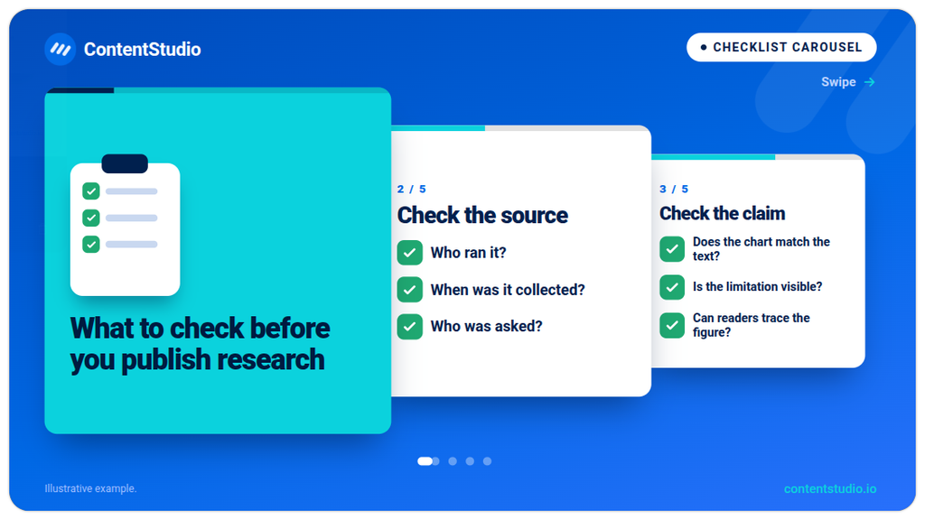
A standard post fits a short observation, a simple announcement, or a focused question. Native video fits ideas where movement, voice, or demonstration is essential. LinkedIn articles fit topics that need sustained explanation, substantial evidence, or qualifications that would become unreadable on slides. A carousel can summarize a longer resource, but it should never hide essential qualifications in tiny footnotes.
Platform requirements and design recommendations are different things, so separate them before you open your design tool. LinkedIn’s document-sharing instructions set the requirements below.
| Item | LinkedIn’s published guidance |
|---|---|
| Core supported formats | PDF, PPT, PPTX, DOC, DOCX |
| Maximum file size | 100 MB |
| Maximum length | 300 pages |
| Document selection | One file |
| Document title | Added during upload |
| Mixed page sizes | Fit pages to the same size |
| Layered PDFs | Flatten or merge multiple layers |
| Animations and embedded video | Display as static images |
| Changes after publication | Edit the description, but not the document |
| Downloads | People who can view the post can download the document as a PDF |
The 300-page limit is a technical maximum and not a target for a feed carousel.
LinkedIn recommends converting files to PDF where possible to improve upload quality. A PDF also gives you a clear final asset to inspect before publication, so open the exported file and review the actual pages instead of trusting the design-tool preview. The review should confirm that:
For an organic document carousel, the page shape should suit the content and stay readable on a phone. The canvases below are practical design choices, not mandatory pixel dimensions. They appear in current carousel-creation guidance, while LinkedIn’s own document instructions emphasize consistent page sizes and do not prescribe one canvas.
| Layout | Example canvas | Useful starting point for |
|---|---|---|
| Square | 1080 × 1080 pixels | Short explanations, diagrams, reusable slide layouts |
| Portrait | 1080 × 1350 pixels | Checklists and vertically arranged explanations |
| Landscape | 1920 × 1080 pixels | Existing presentation material or wide diagrams |
A dense landscape presentation exported as a portrait carousel does not become readable by magic. The shape you intend to publish should come first, and the hierarchy, spacing, and copy follow from it. A wide process diagram may need a simplified version or several pages, not a smaller font.
A phone review of the exported PDF should answer five questions:
When the answers disappoint, cut content before you shrink essential text.
A workable process starts with the reader’s question and ends with a checked publishing file. Nine steps get you there.
Finish this sentence first: “This carousel helps [reader] understand or do [specific task].” For example, “This carousel helps first-time managers prepare a clearer project handoff” works far better than “a carousel about leadership.”
The material that supports the promise can include your own experience, approved process documentation, an identifiable source, a genuine question, an example you can share, or an explanation of a trade-off. Invented customer outcomes and statistics never make a carousel more authoritative.
Not every interesting topic needs slides. The ideas that do tend to involve several steps, a meaningful comparison, a checklist, a change over time, a process that a diagram can clarify, or a decision with distinct criteria. If you still need a topic, a roundup of LinkedIn post ideas can start the search, and the best pick is the one that becomes clearer when readers move through it in stages.
Each page needs a job. The roles below give you a starting structure, and you can combine them when the message is simple.
| Slide role | What it does |
|---|---|
| Cover | States the problem or useful promise |
| Context | Explains the situation or scope |
| Main explanation | Develops the steps, comparison, or framework |
| Example | Shows how the idea applies |
| Summary | Makes the main lesson easy to recall |
| Closing action | Suggests a relevant next step |
A context slide that merely says the topic is important wastes a page. It should explain something the reader needs to know.
A cover should help the right reader recognize the subject.
| Broad opening | More specific opening |
|---|---|
| Better teamwork | Five questions to answer before a project handoff |
| Our latest report | What our hiring survey can, and cannot, tell candidates |
| Marketing tips | A checklist for reviewing a customer story before publication |
| Product update | What changes in the reporting workflow after this release |
Specificity does not require exaggerated urgency or a promise of guaranteed results, and the following pages must deliver on the cover’s promise.
A short headline plus enough supporting copy to explain it works well. This example shows the level of detail that works:
Assign one accountable owner. Name the person responsible for the next decision. “The team” is not a clear handoff owner.
That slide gives the reader a concrete instruction and explains why it matters. Cutting it down to “Be accountable” would be shorter but less useful, because the slide would turn into a slogan.
Visuals belong on a slide when they reduce the effort needed to understand the idea. A diagram showing a handoff, a screenshot with one highlighted control, a before-and-after example, a simple chart with readable labels, a decision table, and a short timeline all qualify.
Screenshots should crop tightly around the relevant action, since a whole dashboard shrunk onto a slide leaves readers hunting for the point. Data visuals should identify the source and reporting period, explain what the figure measures, and preserve any limitation that affects interpretation.
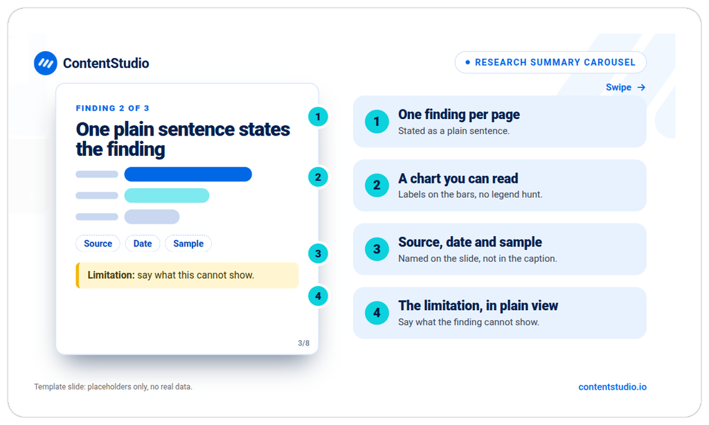
A small set of reusable elements keeps the design coherent: heading and body styles, background and text colors, margins, alignment, page-number placement, source-note placement, and diagram and screenshot treatments. Consistency lets readers concentrate on the explanation and spares them from relearning the layout on every page. Contrast and labels, and not color alone, should communicate any important difference.
Not every carousel should end with “Book a demo.” When the reader is still learning, a practical instruction often fits better than a commercial one. Useful next steps include applying the checklist to an upcoming project, reviewing one unanswered question with the team, reading the full research, exploring a related example, asking a specific question about the process, or visiting a relevant product resource.
One exported document should contain the complete sequence. LinkedIn advises flattening or merging layered PDFs and fitting differently sized pages to one page size, and it warns that animations and videos display as static images. After export, a final review should confirm that:
The exported PDF is the publishing asset, not merely a preview.
The example below shows how a practical topic becomes a sequence. It is an illustrative structure and not a documented customer case study. The topic is “Five questions to answer before a project handoff.”
| Slide | Suggested headline | What to include |
|---|---|---|
| 1 | Before you hand off the project, answer these five questions | The audience and the promise |
| 2 | What changes hands? | The deliverable, current status, and boundaries |
| 3 | Who owns the next decision? | One accountable person and relevant contributors |
| 4 | What remains unresolved? | Open questions, risks, and dependencies |
| 5 | Where does the working information live? | The approved document or workspace |
| 6 | How will both sides confirm acceptance? | The review point and acceptance criteria |
| 7 | Put the answers in one handoff note | A compact example with fields for owner, status, risks, and next action |
| 8 | Check the unanswered question before sending | A clear action for the reader’s next handoff |
Each page answers part of the cover’s promise. The example page turns the questions into a usable resource, and the ending tells readers what to do with it. The sequence leaves out an unrelated company-history page, a motivational quote, a product pitch on every slide, and a page that repeats each earlier point.
The caption adds context without copying every slide:
A completed task can still create a poor handoff. The next person needs more than a file. They need to know what is ready, what remains open, and who owns the next decision. This document brings those questions into one short review. Before your next handoff, check which answer you would struggle to give clearly.
The caption and the document title are separate fields with different jobs, and each deserves its own attention.
LinkedIn asks you to add a document title during upload, and a descriptive title identifies the resource. Strong examples include “Project Handoff Checklist,” “Preparing for Your First Interview,” “Three Options for Reviewing Customer Feedback,” and “Research Findings and Methodology Notes.” An internal filename such as final-approved-v12.pdf makes a poor public-facing title.
The accompanying post text explains who should read the document, what situation it addresses, one useful observation, any qualification the reader needs, and where an essential resource link leads. A LinkedIn post generator can produce alternative caption drafts when you supply the actual topic, audience, and takeaway. You still need to check the output against the document, because the tool generates post copy and does not replace factual review or slide design.
Hashtags and mentions belong in a caption only when they genuinely identify the topic or contribution. The LinkedIn hashtags guide covers selection and formatting in detail, so this step can stay brief.
LinkedIn’s upload workflow differs slightly between desktop and mobile, and both start with a finished document.
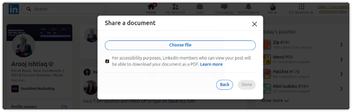
1. In LinkedIn, select Start a post.
2. In the post composer, open More.
3. From the menu, select Add a document.
4. From your computer or an available cloud option, choose one document.
5. In the title field, add a descriptive document title.
6. Next, select Done.
7. In the text box, add the accompanying post text.
8. Before posting, review the file and the publishing account.
9. When everything is ready, select Post.
Before you publish from a Company Page, confirm that the composer shows the intended Page and not your personal profile.
The mobile workflow uses slightly different labels:
1. In the app, tap Post.
2. In the composer, open More.
3. From the menu, tap Document.
4. From your device or an available cloud service, select one file.
5. In the title field, add a document title.
6. Next, tap Next.
7. In the text box, add the post text.
8. Before posting, check the account and document.
9. When ready, tap Post.
A cloud source may require its app on your device, according to LinkedIn, and a corporate cloud account can also need administrative approval. A local, approved copy of the file gives you a fallback if the cloud route causes problems.
Once the document is final, a LinkedIn scheduler lets you prepare publication in advance. ContentStudio’s current documentation supports PDF carousel publishing to LinkedIn profiles and Company Pages, and its documented workflow runs as follows:
1.In ContentStudio, open Compose Post.
2.Next, select the LinkedIn account.
3.In the caption field, enter the caption or description.
4.From the composer, open Media Library.
5.With the Types filter, select PDF.
6.Next, select the final PDF and choose Add Media.
7.Before continuing, check that the LinkedIn Carousel option is enabled.
8.In the title field, enter the carousel title.
9.At the end, choose Post Now or Schedule.
ContentStudio’s documentation states that it does not edit PDF pages or reorder them after upload. Any change to the pages therefore belongs in the source file, with a fresh export of the correct PDF before you prepare publication.
The PDF carousel scheduling walkthrough demonstrates the general process of creating a PDF and scheduling it through ContentStudio. It dates from November 2023, so interface details may differ from the current steps above.
The strongest carousel subjects share one trait: the page sequence improves understanding. Six patterns work especially well.
Example: “What happens between accepting an offer and a new employee’s first day?” One page per stage works well, finished by a checklist of the information the new hire should receive.
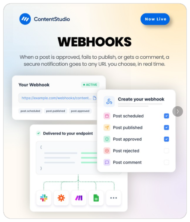
Example: “Three ways to collect customer feedback, and what each can miss.” The same criteria should apply to every option, and the comparison should show the strengths of the alternatives as well.
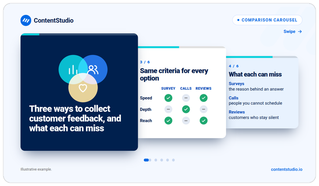
Example: “Three findings from an industry survey, with the questions behind them.” The summary needs the source, date, population, and limitations that readers need to interpret the findings.
Example: “How an incoming support question becomes a reusable help resource.” A short diagram, a realistic example, and the review points carry the explanation, and screenshots should lose any private information.
Example: “What changes when a team optimizes a system for speed rather than resilience?” Diagrams and a specific scenario help, and no choice should appear universally correct.
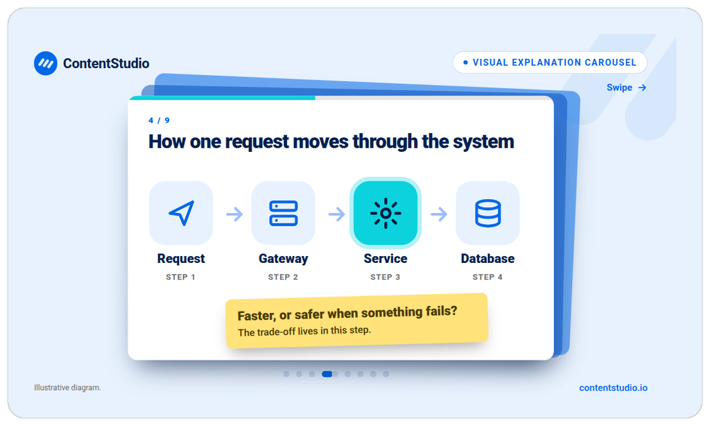
Example: “What candidates can expect at each interview stage.” The carousel explains the purpose of each stage, what candidates should prepare, and where they can find the official requirements.
Most carousel problems trace back to a handful of causes. The fixes below follow the order in which they usually appear.
The file should meet every requirement in the specification table before you redesign anything. A local test opening confirms the file works, and fitting all pages to one size, flattening multiple PDF layers, and re-exporting the document remove the usual culprits. These checks help narrow the issue, but they do not establish the cause of every upload error.
The fix belongs in the original presentation or design file, followed by a new export. Publishing tools do not necessarily let you rearrange PDF pages, and ContentStudio explicitly says it provides no PDF editing or page reordering.
A layout review beats simply increasing the document’s dimensions. Shorter supporting copy, a clearer headline, a cropped screenshot, fewer chart categories, more than one slide for a complex explanation, or a different format for material that needs extensive context can each solve it. If readers must zoom to understand essential information, the slide is not ready.
LinkedIn states that animations and videos inside uploaded documents display as static images. Native video is the right choice when movement is necessary to understand the content.
Essential resource URLs belong in the accompanying post text and not only inside a slide. The exported PDF also deserves a separate test, since the feed viewer and a downloaded PDF reader may not provide the same interaction. Paid Document Ads behave differently again. LinkedIn explicitly states that document hyperlinks become clickable only after the member downloads the file, which differs from the destination URLs on image-card carousel ads.
LinkedIn says replacing shared rich media requires deleting the post and creating another. A careful PDF check before publication prevents that, and if a correction becomes necessary, the new post should tell people who already saw the original what changed.
Readable design is necessary, but it is not the entire accessibility review. Document sharing also raises permission questions that deserve a check before upload.
Clear language, descriptive headings, strong text contrast, and directly labeled charts form the base. Differences should never rely on color alone, source notes should stay readable, and the exported PDF’s reading order and text deserve a review where your authoring tool allows it. A concise text summary in the caption adds another path to the content. The upload process does not make a document accessible automatically.
LinkedIn states that people who can view your document post can download it as a PDF, so the material must be safe outside the feed. Before publishing, confirm:
The question comes before the numbers. A research summary, a recruitment explanation, and a product tutorial do not share the same outcome, so each needs its own evidence.
| Carousel purpose | Evidence to review |
|---|---|
| Explain a professional topic | Relevant questions, substantive comments, and available distribution data |
| Introduce expertise | Available post-attributed profile activity and follows |
| Send readers to a resource | Correctly defined external-link activity and destination analytics |
| Support recruitment | Relevant candidate questions and recorded recruiting activity |
| Educate customers | Recurring questions, feedback, and documented use by customer-facing teams |
Available metrics differ between member posts and Company Page reports. Member analytics includes saves and sends, for example, while Page-click definitions include actions beyond external website visits.
The LinkedIn analytics guide explains access and reporting, and your own metric definitions should stay consistent across posts. A swipe-completion rate cannot come from impressions or reactions, so calculate a completion measure only when the actual report supplies a valid completion event and denominator.
Each comparison should record the topic, account, document length, publication time, and observation window. Patterns across similar posts can guide you, but a different result does not prove that the cover, the slide count, or the format caused the change, because topic, audience, timing, and distribution can differ too. The findings should point to a sensible next improvement and should not become a universal carousel formula.
One last pass catches the mistakes that cost the most. Before publishing, confirm that:
A useful LinkedIn carousel begins with an idea that becomes clearer in sequence. When you define the reader’s question, give each slide a purpose, and check the final document before uploading it, the format does its job.
Your next step is practical: take one process, comparison, or checklist you already understand, outline the pages in text, and build only the slides the explanation needs.
Square 1080 × 1080 and portrait 1080 × 1350 canvases offer practical starting points, though neither is a mandatory organic-document size. All pages should share one size, and the result should read comfortably on a phone.
Enough pages to complete the explanation without repeating it. LinkedIn allows up to 300 pages, but that limit says nothing about an ideal length, so an outline that drops every page not advancing the idea is the best guide.
Not automatically. A fair comparison uses content with a similar purpose, the same reporting definitions, and a comparable observation window. A high engagement total does not show better traffic, qualified interest, or business outcomes, and member-post and Page reports count some actions differently.
Only after you merge them into one document. LinkedIn’s workflow selects a single file, and ContentStudio also documents a one-PDF-per-carousel limit, so the combined file’s order, dimensions, size, and page count need a review first.
Yes. LinkedIn says members who can view a document post can download it as a PDF, which makes a permissions and confidentiality check before publishing essential.
Not reliably. LinkedIn states that videos and animations in uploaded documents display as static images, so native video is the better choice when movement is essential.
Arooj Ishtiaq is a Content Marketing Strategist with 5+ years of experience writing about social media, SaaS, and AI. At ContentStudio, she creates practical guides, tutorials, and how-to content that help marketers navigate social media trends, sharpen their strategies, and get more from their content.
View all posts by Arooj IshtiaqRecommended for you
LinkedIn Company page guide: How to create, optimize, and grow it
LinkedIn marketing in 2026: Strategy, content, and growth
LinkedIn articles: How to write, publish, and use long-form content

How to Use LinkedIn Hashtags Without Overdoing It