ContentStudio API plan is now available. Create automations using Claude, Zapier, n8n, make, etc. Explore plan!
Responsive design
What is responsive design?
Responsive design is an approach to web design and development that ensures content and layouts automatically adapt to different screen sizes, resolutions, and devices.
This adaptive approach provides optimal viewing experiences across desktops, laptops, tablets, and smartphones without requiring separate versions of a website or app.
In today's multi-device world, responsive design has become essential for businesses to effectively reach audiences wherever they engage with digital content.
For marketers and content creators, responsive design principles extend beyond websites to social media posts, email campaigns, and digital advertisements.
Understanding how content displays across different platforms and devices is critical for maintaining brand consistency and ensuring your message reaches your target audience effectively, regardless of how they access it.
How does responsive design work?
Responsive design functions through a combination of flexible grids, layouts, and intelligent use of CSS media queries.
Instead of creating fixed layouts, responsive design uses relative units (like percentages) rather than absolute measurements (like pixels). This approach allows content to fluidly resize and reorganize based on the available space.
The key components that make responsive design work include:
- Fluid grids: These use relative units (percentages) to define layout widths rather than fixed pixels, allowing content to scale proportionally to screen size.
- Flexible images and media: Visual content automatically adjusts to fit different screen dimensions without distortion.
- CSS media queries: These detect the device's characteristics (like screen width) and apply specific styling rules accordingly.
- Breakpoints: Specific screen widths where the layout significantly changes to accommodate different device sizes.
- Mobile-first approach: Designing for mobile screens initially and then progressively enhancing for larger screens.
By implementing these elements, content can seamlessly transition between a smartphone's vertical layout to a tablet's mid-size display to a desktop's widescreen view while maintaining usability and readability.
This adaptability is essential for content creators who need to ensure their messages reach audiences across all devices.
Benefits of responsive design for social media marketing
For social media marketers, responsive design principles offer numerous advantages that directly impact campaign performance and audience engagement:
- Improved user experience: Content displays properly regardless of which device audiences use to view it, eliminating frustration from cut-off images or text that's too small to read.
- Increased reach: Your content becomes accessible to users across all devices, expanding your social media reach significantly.
- Better engagement rates: When content displays correctly, users are more likely to engage with it through likes, comments, and shares, improving your social media engagement rate.
- Higher conversion rates: Properly displayed calls-to-action and forms make it easier for users to complete desired actions.
- Time and resource efficiency: Instead of creating multiple versions of content for different platforms, responsive design enables a more streamlined content workflow.
- Futureproofing: As new devices with different screen sizes enter the market, responsive content will continue to display appropriately, aligning with future social media trends.
Implementing responsive design principles in your social media strategy ensures your content performs optimally across all platforms and devices, helping you reach your audience wherever they are. This approach is especially important for businesses managing multiple social media accounts.
Platform-specific considerations for responsive design
Each social media platform has unique requirements for responsive content. Understanding these specifications is crucial for creating content that looks professional across all channels.
Image and video dimensions
Social media platforms frequently update their preferred dimensions for visual content. Staying current with these specifications ensures your content displays properly. Social media image sizes and dimensions vary significantly across platforms:
- Instagram: Square (1:1), portrait (4:5), and landscape (16:9) ratios for feed posts; 9:16 for Stories and Reels
- Facebook: Various formats for different placement types (feed posts, cover photos, event images)
- Twitter: 16:9 for timeline images, with different requirements for profile banners
- LinkedIn: Professional-focused dimensions for company pages, profile images, and post content
- TikTok: Vertical video format (9:16) optimized for full-screen mobile viewing
- Pinterest: Tall, vertical images (2:3 ratio) perform best for maximum visibility
Using the correct image sizes for social media posts is essential for professional presentation and maximum engagement.
Mobile optimization priorities
When implementing responsive design for mobile users, prioritize:
- Font size and readability: Ensure text remains legible on small screens without requiring zooming.
- Touch targets: Make interactive elements (buttons, links) large enough for accurate finger tapping (minimum 44×44 pixels).
- Loading speed: Optimize image sizes and code to ensure fast loading times on mobile connections.
- Vertical scrolling: Design for intuitive vertical navigation rather than horizontal scrolling.
- Simplified layouts: Remove non-essential elements that could clutter small screens.
By focusing on these priorities, your social media content plan will effectively reach audiences on all devices.
Tools for creating responsive social media content
Several tools can help marketers create responsive content that displays correctly across all devices:
- Design platforms: Tools like Canva, Adobe Express, and Figma offer templates pre-sized for various social platforms.
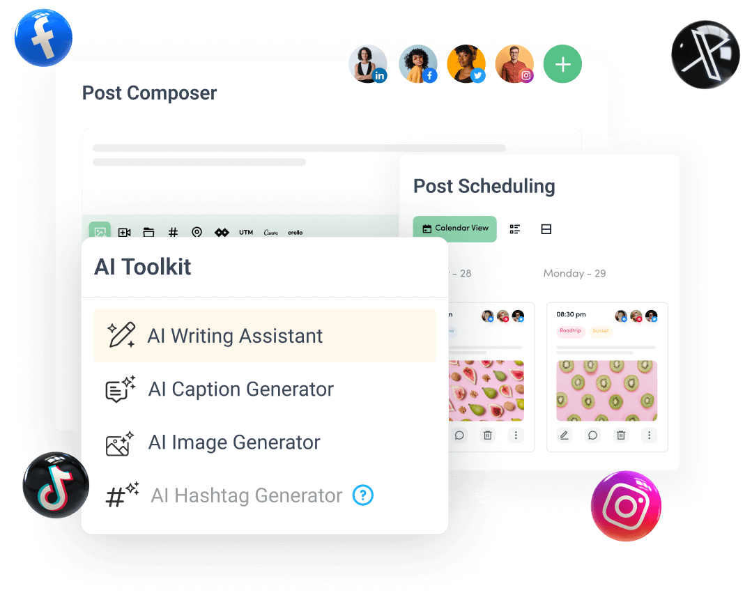
- Social media management tools: ContentStudio's social media publishing tool provides preview functions to check how posts will appear on different platforms before publishing.
- Image editors: Applications that allow you to crop and resize images to platform-specific dimensions.
- Content creation tools: ContentStudio's AI content assistant helps generate content optimized for different platforms.
- Analytics tools: Track performance across devices to understand how responsive design impacts engagement.
- Mobile preview tools: Test how your content appears on different screen sizes before publishing.
Best practices for responsive design in social media
To maximize the effectiveness of responsive design in your social media strategy:
- Design for the smallest screen first: Start with mobile designs and expand to larger screens, ensuring critical information is visible without scrolling.
- Test across multiple devices: Before publishing, view your content on phones, tablets, and desktops to ensure it displays properly everywhere.
- Use platform-native tools: Most social platforms offer built-in creators that automatically optimize content for their environment.
- Prioritize readability: Ensure text remains legible at all sizes and contrasts well with background elements.
- Optimize media loading: Compress images and videos appropriately to reduce loading times without sacrificing quality.
- Create platform-specific versions when necessary: While responsive design helps content adapt, sometimes creating platform-specific versions yields better results, particularly for Instagram aesthetics or TikTok's vertical format.
- Consider accessibility: Design for all users, including those with disabilities, by using sufficient color contrast, alternative text, and readable fonts.
- Plan for truncation: On some devices, text may be cut off, so place the most important information at the beginning of titles and descriptions.
By following these practices, you'll create content that delivers consistent experiences to your audience regardless of the device they use, helping you boost social media engagement and achieve your marketing objectives.
Implementing responsive design in your content workflow
Incorporating responsive design principles into your content creation process requires planning and tools. Here's how to integrate it into your workflow:
- Audit current content: Assess how your existing content displays across devices to identify improvement opportunities.
- Create device-specific templates: Develop templates that account for different screen sizes while maintaining brand consistency.
- Establish guidelines: Document responsive design standards for your team to follow, including preferred dimensions and formats.
- Utilize scheduling tools: Use ContentStudio's social media calendar to plan and preview content across platforms.
- Leverage automation: Implement tools that automatically adjust content for different platforms, like ContentStudio's social media automation tool.
- Monitor performance by device: Track how content performs on different devices to refine your approach over time.
- Train your team: Ensure everyone understands responsive design principles and how to implement them.
By systematically incorporating responsive design into your workflow, you'll create more effective content with less effort, leading to better engagement and results across all platforms and devices.
Create, plan, schedule, and publish posts on all social media networks


