LinkedIn Company page guide: How to create, optimize, and grow it
Sep 24, 202621 minutes

Written by
Arooj IshtiaqUpdated
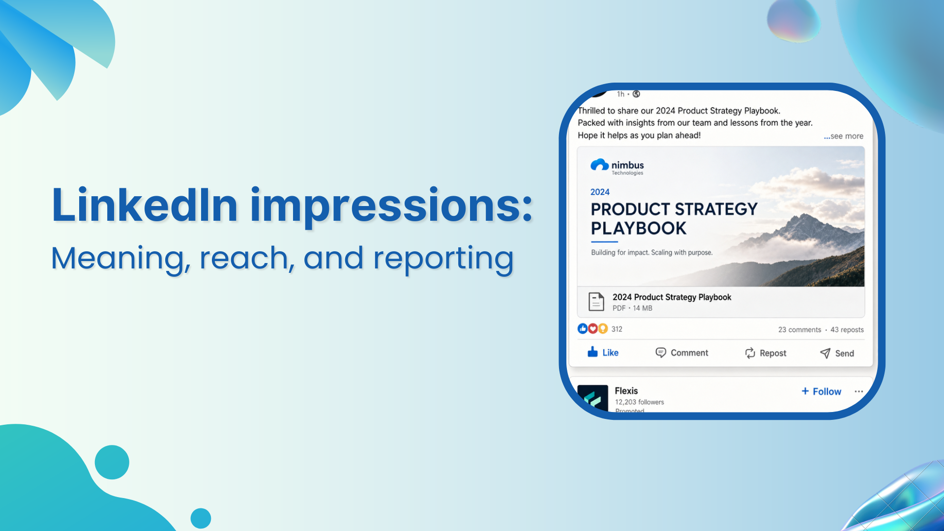
An impression is one display of a LinkedIn post. It does not mean one person saw the post, clicked it, agreed with it, or became a lead. It simply records that the post appeared on LinkedIn. That sounds straightforward, but the number becomes useful only when it is read alongside unique viewers, engagement, audience relevance, and the action that followed.
The wider LinkedIn marketing strategy should determine what the business wants its content to accomplish. This guide focuses on one reporting measure within that system:
Teams that want to connect scheduled content with performance can use a shared reporting workflow to keep planning, publishing, and review in the same place.
You will learn what counts as an impression, how impressions differ from members reached and views, what in-network and out-of-network distribution means, how to calculate useful ratios, and how to avoid confusing a large display number with meaningful business impact.
Key takeaways
The main points below provide a quick reference before the detailed explanations and examples.
LinkedIn impressions are the number of times a post is displayed on LinkedIn. If the same person sees the post twice, that can create two impressions. A post may be displayed in a Feed, through a repost, on a profile, in a search-related context, or elsewhere LinkedIn surfaces eligible content.
The metric is useful because it gives you a starting view of distribution. It shows whether LinkedIn displayed a piece of content often enough to assess. It does not tell you how many people were interested, how long they paid attention, or whether the post helped the business.
The practical rule is simple: an impression is created when LinkedIn displays the post. It is not limited to a person clicking a link, expanding the text, reacting, commenting, or watching a video to completion. A display is enough for the count to increase.
This distinction matters because marketers often read impressions as “people reached.” The two numbers answer different questions. Impressions measure displays and members reached estimates unique viewers.
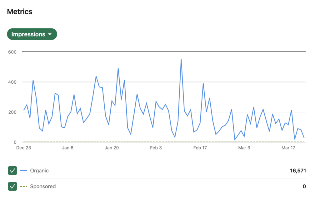
Impressions and members reached should be read together. Impressions tell you how many displays occurred. Members reached tells you how many distinct members and Pages saw the post, without counting repeat exposure. When the impression total is higher, it usually means some members encountered the post more than once.

The table below separates the two measures so a report does not treat repeat displays as new people.
| Metric | What it counts | What it answers | What it does not prove |
|---|---|---|---|
| Impressions | Every time the post was displayed | How much total display volume did the post receive? | How many unique people saw it or whether they found it useful |
| Members reached | Distinct members and Pages that saw the post, excluding repeat views | How broad was the post’s estimated unique audience? | Whether the audience was relevant or took action |
| Frequency estimate | Impressions divided by members reached | How often did the average reached member see the post? | Whether each display was noticed or persuasive |
For a full explanation of the unique-viewer side of the report, see how distinct viewers are counted.
A simple frequency estimate helps explain the relationship between display volume and unique audience size. It is not an official LinkedIn score, and it does not prove attention, but it can help you understand whether a post was repeatedly displayed to a smaller audience or shown once across a broader group.
Frequency estimate = impressions ÷ members reached
For example, a post with 8,000 impressions and 5,000 members reached has an estimated frequency of 1.6. On average, the people reached were shown the post 1.6 times. The result should be interpreted carefully because it is an average across the reached audience, not a record of what every member saw.
Impressions, reach, and views are often used as though they mean the same thing. They do not. The terminology can also vary by content type and by platform, which is why reports should define each term before comparing results across channels.
This comparison gives a practical way to keep the terms separate.
| Term | Simple meaning | Best use in a report |
|---|---|---|
| Impressions | Total times a post was displayed | Assess overall visibility and repeat exposure |
| Reach, or members reached | Distinct members and Pages exposed to a post | Assess approximate audience breadth |
| Views | A content-specific action, often tied to a video or another media format | Assess whether people initiated or consumed a particular asset |
| Engagement | Actions such as reactions, comments, reposts, clicks, and saves where available | Assess the kind of response the content created |
| Conversions | Desired actions after exposure or a click | Assess whether the post contributed to a business or professional outcome |
A high view count on a video, for example, should not be reported as the same thing as unique reach. Each measure describes a different point in the content journey.
LinkedIn can show whether impressions came from people already connected to or following you and from people outside that existing network. This split helps a creator or brand understand whether a post is mainly circulating among familiar audiences or being shown more widely.
The distinction below is useful for diagnosing distribution, but neither category is automatically better. A B2B team may value in-network attention from current customers and target accounts, while a new creator may be testing whether useful content is reaching people beyond existing followers.
| Distribution type | Who is included | What it may indicate |
|---|---|---|
| In-network impressions | People who follow or are connected to the publisher | Existing audience recognition, relationship context, and follower activity |
| Out-of-network impressions | People outside the publisher’s direct network or follower base | Potential discovery beyond current connections and followers |
| Mixed distribution | A combination of both sources | A post that is circulating among existing audiences and new relevant viewers |
The route to impression data depends on the account and content type. Individual posts normally provide the clearest post-level data. Creator and personal-profile views can show combined content trends. Company Page administrators can access content analytics for a wider view of Page posts and campaigns.
Open the published post and select the available analytics view. LinkedIn may show impressions, members reached, interaction data, and audience information. The exact fields can vary by account type and platform updates, so use the information shown in your current analytics experience rather than relying on old screenshots.
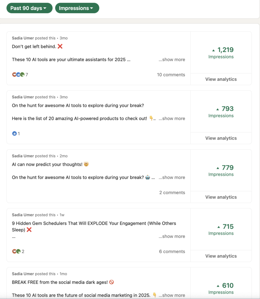
Company Page administrators can open the Page in admin view and select the available content analytics. This area can help teams compare post performance, time periods, content types, and audience response. A Page-level view is particularly useful when several team members publish under the same brand account.
If the Page attracts visitors after a high-visibility post, the next question is whether the Page gives them enough context. The guide to improving the Company Page experience explains how to make the brand destination clearer for prospective customers.
An impression count has no single meaning by itself. The same number can be encouraging or disappointing depending on the size and relevance of the audience, the post objective, the account’s normal range, the content format, and the action that followed. Context turns a display count into a useful insight.
High impressions are encouraging when they support the purpose of the post. A broad awareness post, a well-timed industry interpretation, or a practical framework may benefit from wide distribution if the people seeing it are relevant to the brand or creator.
A high number can look impressive while hiding a weak outcome. Broad distribution may come from an audience that is not relevant, or the post may attract reactions without leading to profile interest, useful discussion, or any next-step behavior.
Lower impressions do not automatically mean a post failed. A narrow technical topic may reach fewer people but attract the exact professionals a business wants to influence. A customer-facing post may matter because it reassures existing users, even if it does not travel beyond the current audience.
Engagement rate can help compare similar posts, especially when impression totals differ. It should not be treated as a universal quality score. The calculation needs to remain consistent, and the result should be read alongside the post objective and the relevance of the people who responded.
Engagement rate = (reactions + comments + reposts + clicks) ÷ impressions × 100
Some reporting setups include saves when they are available. The important point is to document the formula and use it consistently. A conversation-led post, a resource post, and a visual reference post may create different kinds of valuable engagement, so they should not be judged by one number alone.
For a wider view of how each measure should relate to a business objective, use the guide to metrics matched to business outcomes.
Impressions can rise or fall for many reasons. The answer is rarely one isolated algorithm factor. Post topic, audience fit, relationship context, format, publishing time, competition in the Feed, the clarity of the message, and the quality of the interaction can all influence how widely a post is displayed.
The list below is designed as a diagnostic tool. It helps you identify a likely area to review without pretending that any one factor controls the result.
For a deeper explanation of why content distribution can vary, see how Feed relevance affects post visibility.
Improving impression quality is more valuable than simply chasing a larger display total. The aim is to create content that the right people are likely to notice, understand, and use. That requires clearer audience focus, stronger topic selection, and a repeatable way to learn from results.
A post written for “everyone” often reaches no one in a meaningful way. Start with a recognisable professional situation, such as a marketing manager trying to shorten approvals, an agency owner handling client reporting, or a founder deciding how to make subject-matter expertise visible.
The opening should help the right reader recognise the topic quickly. It does not need to create artificial suspense. A clear problem, observation, question, or lesson is usually more useful than a broad promise that the rest of the post cannot support.
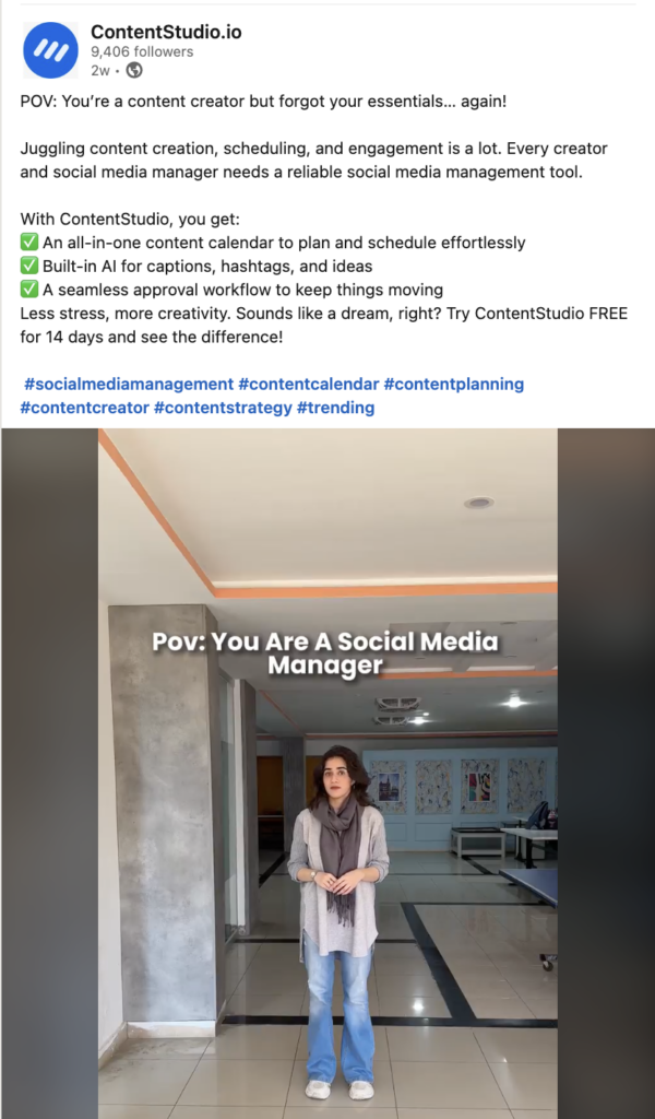
Reference-style content can earn repeat attention because it gives readers something practical to save, share, or return to. A concise framework, a decision checklist, a customer-safe lesson, or a specific answer to a common question is often more useful than a generic list of advice.
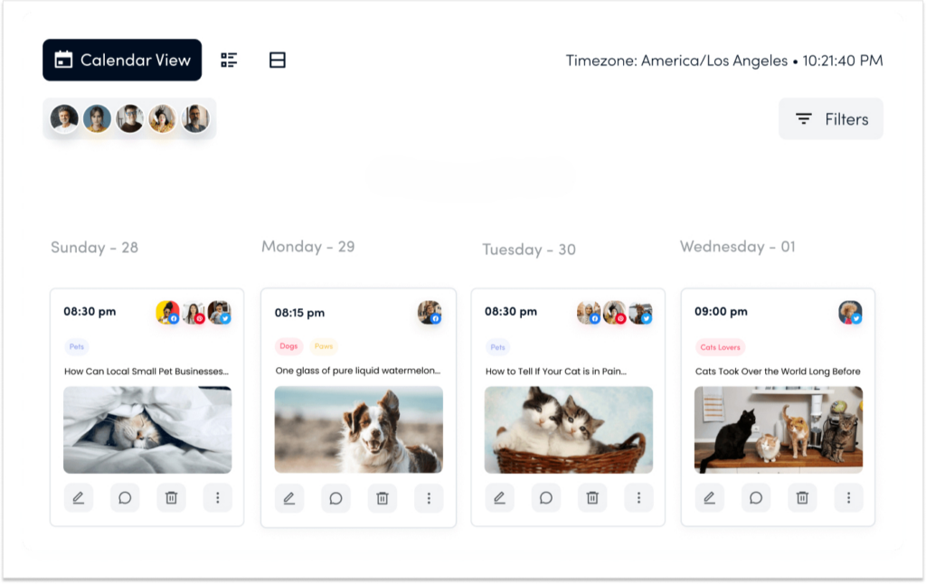
Consistency helps a team learn which themes, formats, and messages connect with the intended audience. The purpose is not to publish every day. It is to create enough comparable work that the team can see patterns, improve the next post, and build recognition around a useful set of topics.
A practical content-planning process can help turn impression patterns into better topic choices instead of reacting to every post in isolation.
Impressions should be included in a report as one part of a story. A useful report explains what was displayed, who it appears to have reached, what those people did, and what the team plans to change next. It does not treat display volume as proof that the content achieved its objective.
The framework below gives a concise way to discuss impression data without creating a report that is full of numbers but short on decisions.
| Report element | What to include | Question it answers |
|---|---|---|
| Post objective | The intended audience and the action the post was meant to support | What was this post trying to do? |
| Distribution | Impressions, members reached, and in-network or out-of-network context | How widely was it shown and to whom? |
| Interaction | Comments, reposts, clicks, saves, and the quality of engagement | What did people do after seeing it? |
| Audience relevance | Relevant roles, companies, followers, profile visitors, or account activity | Did the right people pay attention? |
| Business context | Resource activity, messages, registrations, leads, or sales context where available | Did the content support a meaningful next step? |
| Next action | One change to repeat, improve, stop, or test | What will we do differently next time? |
A more complete analytics review process can help teams connect post-level results with Page trends, audience data, and recurring reporting.
Monthly comparisons are more reliable than reacting to a single number after publication. They make it easier to see whether a topic, format, or audience segment is producing a repeatable pattern.
The table below shows how to turn common impression patterns into a measured next step.
| What you observe | What it may mean | What to test next |
|---|---|---|
| Impressions rise, but relevant engagement stays flat | Distribution increased, but the message may not be useful to the intended audience | Narrow the problem and improve the practical value of the post |
| Members reached rises but clicks are weak | More people saw the post, but the resource or CTA may not fit their intent | Improve the resource context and the next-step wording |
| In-network share is high, and out-of-network share is low | The content is circulating mostly among familiar audiences | Test a clearer topic angle or a new useful format for discovery |
| Impressions are modest, but target accounts engage | The post may be narrow but strategically relevant | Create a follow-up with deeper evidence or a useful resource |
| Frequency rises while members reached stays flat | Repeat exposure is increasing without broader audience growth | Review topic reach, audience relevance, and whether the post is being shared beyond the existing network |
| A practical post earns saves and questions | The audience may value the content as a reference | Turn the subject into a series or supporting resource |
Organic impressions come from unpaid content distribution. Sponsored impressions come from paid delivery through LinkedIn advertising. Both can appear in reporting, but they should not be blended without a clear label because the distribution logic, audience controls, cost, and expected outcomes differ.
A report should separate organic and paid results, then compare them against their own objectives. Organic content may aim to build recognition and conversation over time. A sponsored campaign may aim to reach a defined audience, generate leads, or drive registrations. The same impression total can have very different meaning in each context.
Impression reporting becomes less useful when display volume is separated from the reader, the post objective, and the next action. The mistakes below are common because they make the number look simpler than it is.
| Mistake | Why it creates confusion | Better approach |
|---|---|---|
| Treating impressions as unique people | The same member can contribute more than one display | Compare impressions with members reached |
| Using impressions as proof of awareness | A display does not prove attention, recall, or understanding | Review engagement, profile interest, and audience fit |
| Comparing unrelated posts | A product launch, a technical framework, and a personal story may have different goals | Compare similar topics and formats against similar objectives |
| Chasing a single benchmark | Audience size, industry, topic, and account maturity vary widely | Establish your own baseline across several comparable posts |
| Ignoring in-network and out-of-network context | The total hides where the distribution came from | Review whether visibility came from existing or new audiences |
| Judging posts only on publication day | Interaction and useful next steps may emerge later | Review weekly and monthly patterns |
| Increasing posting volume without learning | More posts create more data but not necessarily more insight | Use a sustainable rhythm and document what each post teaches |
| Separating reporting from content decisions | Metrics become a scorecard instead of a planning input | Use results to improve the next topic, format, or CTA |
Use this checklist when reviewing a post or preparing a monthly report. It keeps the impression count in proportion with the rest of the available evidence.
LinkedIn impressions are a visibility measure, not a verdict. They tell you how often a post was displayed, but they do not tell you whether the right people saw it, whether they understood it, or whether the post supported a useful outcome. Those answers come from reading impressions alongside members reached, interactions, audience context, and downstream activity.
Use the number to ask better questions. Did the post reach people beyond your existing audience? Were the responses coming from relevant people? Was the practical idea strong enough to earn saves or spark questions? Did the resource drive qualified clicks? When impressions are treated as the start of an analysis rather than the finish, they become much more useful.
The post may have been displayed broadly without creating a strong reason for the intended audience to respond. Check whether the topic was relevant, the opening was clear, the audience matched your target market, and the post offered a useful next step. High display volume alone does not prove the message connected.
Low impressions can result from many factors, including a narrow topic, unclear audience fit, weak message clarity, limited relationship context, inconsistent posting, or competition for attention in the Feed. Review patterns across several similar posts before changing the entire strategy.
Focus on impression quality rather than a single large number. Write for a specific professional audience, use a clear opening, share a useful framework or example, maintain a sustainable publishing rhythm, and review which topics create relevant engagement, profile interest, and meaningful next steps.
A common calculation is total engagement actions divided by impressions, multiplied by 100. You can include reactions, comments, reposts, and clicks, then add saves if your reporting setup makes them available. Use the same formula for similar posts and evaluate the quality of the engagement behind the percentage.
In-network impressions come from people who follow or are connected to the publisher. Out-of-network impressions come from people outside that existing audience. The split helps show whether a post circulated mostly among familiar viewers or gained discovery beyond the current network.
Plan 0 Days of Content in 0 Minutes
Create, schedule, publish and analyze your content across all your social media channels from one simple dashboard.
4.7 on Capterra • 16,500+ marketers trust ContentStudio
Arooj Ishtiaq is a Content Marketing Strategist with 5+ years of experience writing about social media, SaaS, and AI. At ContentStudio, she creates practical guides, tutorials, and how-to content that help marketers navigate social media trends, sharpen their strategies, and get more from their content.
View all posts by Arooj IshtiaqRecommended for you
LinkedIn Company page guide: How to create, optimize, and grow it
LinkedIn marketing in 2026: Strategy, content, and growth

How to see scheduled posts on LinkedIn | Step-by-step
How to Use LinkedIn Hashtags Without Overdoing It